
Missy.a.Wilson
TPF Noob!
- Joined
- Jul 29, 2014
- Messages
- 9
- Reaction score
- 3
- Location
- TN
- Can others edit my Photos
- Photos NOT OK to edit
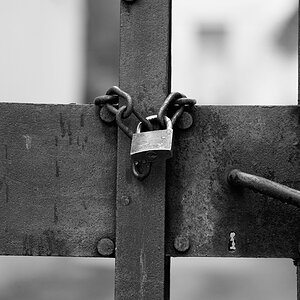
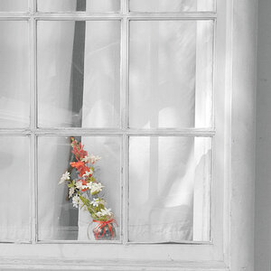
I took this picture in Europe while touring the many churches in Paris. Thoughts?? I intentionally added the graininess. The original is much cleaner. It's one of my personal favorites, but would like others' input. Thanks!


![[No title]](/data/xfmg/thumbnail/38/38443-d3f00036791c5f915b132320c9ac8865.jpg?1734172307)
![[No title]](/data/xfmg/thumbnail/32/32711-b57dd72845f94aa34b3bd7207b07f98c.jpg?1734162320)

![[No title]](/data/xfmg/thumbnail/38/38444-6063bb59cb410c520a1ccccbe58db9c7.jpg?1734172308)