Three Sad Windows

invisible

Been spending a lot of time on here!
Joined
Mar 10, 2007
Messages
5,213
Reaction score
983
Location
Canada
Website
www.federicobuchbinder.com
Can others edit my Photos
Photos NOT OK to edit
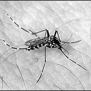
I'm not sure which of these three versions works better for me. Thoughts?

1. Original version
p471791790-4.jpg


2. Some cropping
p1046027976-4.jpg


3. More drastic cropping
p368015945-4.jpg


I guess I'll have to clone out those leafs in the bottom left of versions 2 and 3...

Thanks for looking.
 
Interesting shot! I have an idea... and would like to post an edit with your permission?
 
I like the last one. :)
 
I enlarged the image to 800x600 after cropping.. just to have the larger image. It doesn't have the clarity of your shots, obviously.. but this is what I "saw" when I first looked at the set above....

windows.jpg


you like?
 
I think the drastic crop, and Charlie's crop are both clear winners. I wish Maine had as many decrepit buildings as Canada appears to.

Great work, Federico. :thumbup:
 
I like the 3rd one. Nice capture. It is pretty sad.
 
I like charlie's crop but I would include some of the wall.
 
I've looked at these multiple times...

I think the original, first image, is the best.
 
I like the original, though I like images tension.
 
I like # 3 and Cgipson's version the best, Although # 3 wins for me as I like the overall concept rather than just the windows.
 
Looks like this is a scene that could work with different compositions. I'm still undecided myself. I'll visit this house again in the next few weeks and will make sure to spend some time playing with those windows. Thanks everybody for your feedback.
 
#3 for me! If you can go back, do it and move the twigs.
 
I like them alot too. I would have to agree with Derrel with the first one. I think the bottom part gives it the feel of a foundation and gives the photo a little more dimension. Great work!
 

Most reactions

New Topics

Back
Top