What's new

Tiffany P.

e.rose

Been spending a lot of time on here!
Joined
Jan 27, 2011
Messages
4,789
Reaction score
1,985
Location
Nashville, Tn
Can others edit my Photos
Photos NOT OK to edit
Hi.

I did this shoot with Tiffany a while ago.

1.
IMG_7991.webp

2.
IMG_8004.webp

3.
IMG_8027.webp

4.
IMG_8081 (2).webp

5.
IMG_8130.webp

6.
IMG_8151.webp

7.
IMG_8154.webp
 
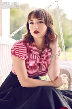
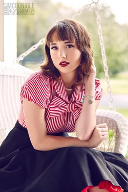
I loooove 5,6 and 7.

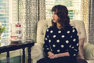
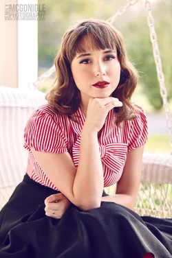
1,2,3 and 4 look kind of like screenshots from a TV interview - that's not a bad thing and actually, the more I look at them the more I like them for that reason.

My biggest problem is with 8, 9, 10 and 11.

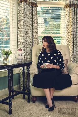
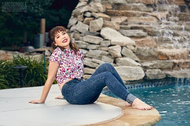
8: The feet are cropped and I think there is a little too much headroom. I think simply pitching the camera down would have made that a great shot. Particularly as her face is highlighted by the dark background.

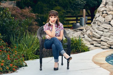
9: I personally would have cropped in a bit tighter and moved her over to the left, as if about to lean back onto the edge of the frame. She's almost floating in the middle at the moment and there's a big stick just behind her head.

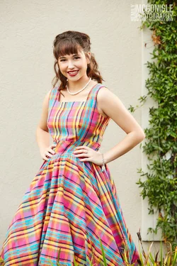
10: Again, I would have cropped tighter (less headroom) and moved her left. It would have balanced out the brightness of right hand side of the frame and again, there would have been just enough dark to highlight her face. As it is, I think the light left and dark right are too "equal" and are conflicting with each other.

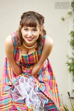
11: Purely a costume design error. I think her pose is fine, but that bend in the tartan of her dress makes her look pregnant. Another tighter crop too - I don't think the ivy adds anything and might actually be fighting for attention from the model. The plainer background would have made the dress (without the pregnant!) really pop.

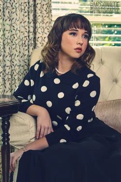
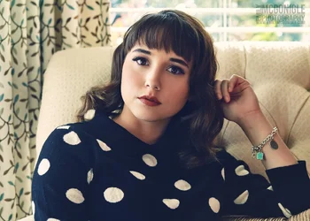
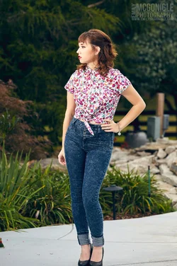
I love the last 4. I have a penchant for a landscape portrait (that should get a few people around here's heckles up ;) ) and the poses in the vertical ones are just great.

Nice work overall :D
 
I loooove 5,6 and 7.

1,2,3 and 4 look kind of like screenshots from a TV interview - that's not a bad thing and actually, the more I look at them the more I like them for that reason.

My biggest problem is with 8, 9, 10 and 11.

8: The feet are cropped and I think there is a little too much headroom. I think simply pitching the camera down would have made that a great shot. Particularly as her face is highlighted by the dark background.

9: I personally would have cropped in a bit tighter and moved her over to the left, as if about to lean back onto the edge of the frame. She's almost floating in the middle at the moment and there's a big stick just behind her head.

10: Again, I would have cropped tighter (less headroom) and moved her left. It would have balanced out the brightness of right hand side of the frame and again, there would have been just enough dark to highlight her face. As it is, I think the light left and dark right are too "equal" and are conflicting with each other.

11: Purely a costume design error. I think her pose is fine, but that bend in the tartan of her dress makes her look pregnant. Another tighter crop too - I don't think the ivy adds anything and might actually be fighting for attention from the model. The plainer background would have made the dress (without the pregnant!) really pop.

I love the last 4. I have a penchant for a landscape portrait (that should get a few people around here's heckles up ;) ) and the poses in the vertical ones are just great.

Nice work overall :D

Thanks for such detailed feedback! :)
 
Oh hey you're still alive and kicking on the forum. Nice work always! :D
 
Oh hey you're still alive and kicking on the forum. Nice work always! :D

I'd call it "barely alive and tripping all over myself", but yes. :lol:

Thank you :allteeth:
 
Killer. The second is my favorite of the second.

Jake
 
Very nice! Lighting looks great and she looks very natural.
 
Should I go there? ;)

Nice set, she has a very retro look.
 
Very nice Rose, aside from Forkie's details, the one thing that REALLY annoys me are the backgrounds here. In 8, 9, and 10, you have that brown post with the pool controls (or whatever they are), and it's always very close to the model. You need to make that go away. In 12, you have just a little bit of ivy creeping in, image right, making it look (to me) like a cropping error. Add more, or remove it all. In 13, 14, and 16 you have the bright spot of the (I assume) sidewalk contrasting with the darker grass. Again, just add grass so the bright area isn't pulling my eye away from the model
 
Killer. The second is my favorite of the second.

Jake

Very nice! Lighting looks great and she looks very natural.

Thank you! :)

Should I go there? ;)

Nice set, she has a very retro look.

Uhhh... I don't.... know?

And thanks, haha. :lol:

Do I have to say it again? lol Nicely done Emily.

Thanks! ^_^

Very nice Rose, aside from Forkie's details, the one thing that REALLY annoys me are the backgrounds here. In 8, 9, and 10, you have that brown post with the pool controls (or whatever they are), and it's always very close to the model. You need to make that go away. In 12, you have just a little bit of ivy creeping in, image right, making it look (to me) like a cropping error. Add more, or remove it all. In 13, 14, and 16 you have the bright spot of the (I assume) sidewalk contrasting with the darker grass. Again, just add grass so the bright area isn't pulling my eye away from the model

Thanks for your feedback! :)
 
Wow that's a big waterfall, for a pool!!!:aiwebs_016:

I agree with the comments above, including #11 I also think she looks pregnant. But it's still nice!
I really love #16, it feels like a really fun shot!!!:1219:

She seems like a great person to work with!
 
Wow that's a big waterfall, for a pool!!!:aiwebs_016:

I agree with the comments above, including #11 I also think she looks pregnant. But it's still nice!
I really love #16, it feels like a really fun shot!!!:1219:

She seems like a great person to work with!

Thanks for your feedback! :)

Em!

Woohoo! To commemorate your return I shall offer you the traditional greeting of my forefathers:

Yo. WaSup?

HAHA.

6uDpT8J.gif
 

Create an account or login to comment

You must be a member in order to leave a comment

Create account

Create an account on our community. It's easy!

Log in

Already have an account? Log in here.

New Topics

Back
Top Bottom