Tina (NWS)

gsgary

Been spending a lot of time on here!
Joined
Oct 31, 2008
Messages
16,143
Reaction score
3,002
Location
Chesterfield UK
Website
www.gsgary.smugmug.com
Can others edit my Photos
Photos OK to edit
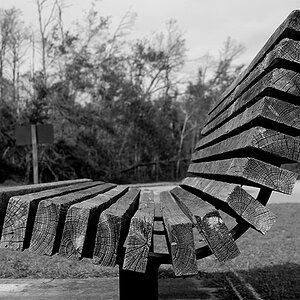
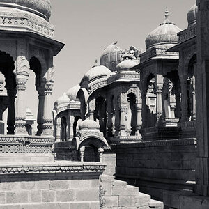
Not my usual subject but got to try everything

1
543858924_YFV7d-L.jpg


2
542989324_ftKVV-L.jpg


3
542985063_NozKy-L.jpg
 
OK, 76 views and no comments. I guess I'll go first.

First of all, Tina has AWESOME eyes. I feel like I'm falling into a trance if I look at them too long.

In photo #1, I think F/9 is a bit too small of an aperture. I think a shallower depth of field would have done wonders for this photo. Looks like you shot this with a 50mm--so I'm sure you had plenty of room to open the aperture. Composition is nice, except that half of her head is missing.

Photo #2:
The best of the three you posted. It is very nicely done. Those EYES!! Once again, shallower depth of field would have worked a little better.

Photo #3:
I hate to say it, but it doesn't do a whole lot for me. I mean, Tina is very pretty and I like looking at topless women as much as the next guy, but, I dunno. I'll let others who are more qualified than me critique it. I think it's the lighting, but I really don't know for sure.

On another note, I've seen lots of your work on here and it is very good, so I'm sure I'm not telling you anything you don't know already. I'm sure your next batch will be off the charts. :cheers:
 
Cheers i did try a shallow DOF on 1+2 but i like these better the crop on one was intentional, i will post some more you might like
 
I have to agree that #3 doesn't really do much for me either. Technically it is great. But the look and pose just seem kinda "eh"...

But I love the highlights of the face in #1 & 2. Her eyes and the "look" are very strong and provocative. I really like the feel of them!
 
I have to agree that #3 doesn't really do much for me either. Technically it is great. But the look and pose just seem kinda "eh"...

But I love the highlights of the face in #1 & 2. Her eyes and the "look" are very strong and provocative. I really like the feel of them!

Cheers mate, looks like #3 has to go
 
Keep her top on fella,

HA. you won't hear me say that too often but you are having much better success with her "dressed"

cheers
jerry
 
I don't know if I care about the topless ones, but the 2nd one does seem to be an improvement over the first one. The white background and her being overly illuminated did make it too bright imo. On the 2nd one you can see more of her body definition. But the poses to me are still.... unmoving?

The other ones are much better though.
 
Please keep in mind that the following comments are not an aesthetic judgment of your subject. And the things that are wrong with the photos are oversights, not crimes. With practice, attention, and good critique you can learn to not overlook them.

#1: Not too shabby but would be much better with less DOF and in black and white.
#2: Just doesn't work. The hands are really kind of pointless. And if you can't find a hair-stylist who will TFP or can't hire one, then at least get a brush. That hair is no good.
#3: Wide hips means do not shoot dead-on.

In the next post
#1: The boy shorts almost work, but I still would shy away from shooting dead-on. To be honest if I were going to try to keep this shot I would liquify a tiny but just above the panty line.
#2: Does not work. There's a lot of things going wrong here...the background, she has no neck, etc.
#3 and #4: Definitely do not work. I think they're scary. Trashy at best.
 
#1 from the first post is your winner...great light, great composition, just a great shot overall.

and like others here, the topless ones aren't working for me...

if you want to continue shooting her topless (and im sure the members will continue to view them for critique :lol:), have you considered posing her just like you have on the other ones?... rather than just a dead-on frontal shot?

she has a great look, and those eyes ARE stunning! she seems like she likes being in front of the camera, so i would DEFINITELY continue working with her.
you found an awesome model...good for you!:thumbup:
 
I noticed in the ones of her standing up (topless ones) you had her facing dead straight at the camera. Did you try anything different, like having her body turned slightly? I'd love to see some different angles posted here.
 
For the topless ones, have you considered using a background that accentuates or mimics the natural curves of the model's body? Like a curved window or door frame?

The first topless one has uneven lighting. You've got so much skin exposed I think that it's really important that you get plenty of light on the front of the subject, and make sure you light evenly using a reflector. If you did have a reflector to camera right, maybe you could move it in further. That way the skin would appear less veiny.
 
Thank's for all your replies, i have taken on board your pointers because as i said this is not my usual type of shoot
one from the side but i don't like it
545306400_rdkVC-L.jpg
 
The eyes are amazing!!! I agree with all above. I love topless women but there is something about it that last one that isn't very flattering. I think its the profile.

Great work though.
 

Most reactions

New Topics

Back
Top