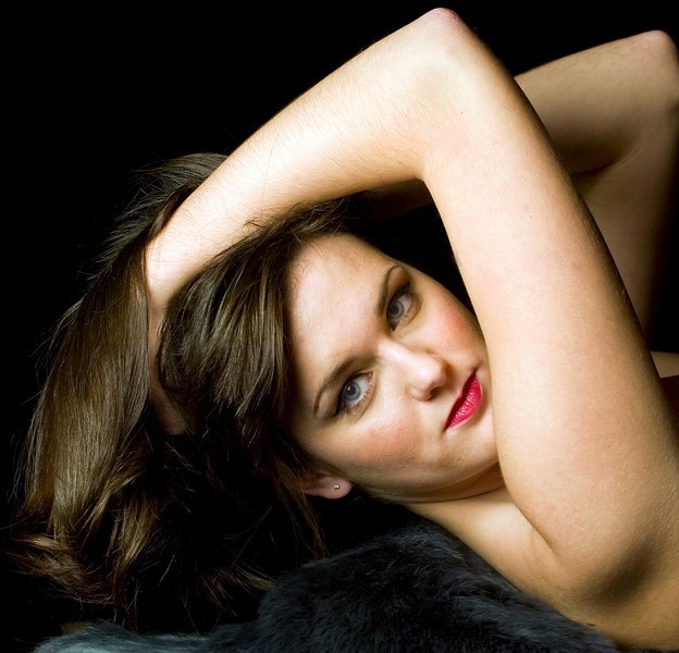
Tina tonight

gsgary

Been spending a lot of time on here!
Joined
Oct 31, 2008
Messages
16,143
Reaction score
3,002
Location
Chesterfield UK
Website
www.gsgary.smugmug.com
Can others edit my Photos
Photos OK to edit
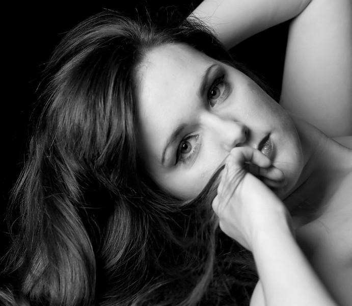
3rd time in the studio first time with Tina, you will find me mostly in photojournal forum with my sports shots so this is a bit out of my comfort zone but i just had to try shooting in the studio, any good ?

1
421192622_4BCfM-L.jpg


2
421198381_m4XEm-L.jpg
 
So beautiful.

Hair on her forearms in the color shot.

BW is closer, my fave. Stunning eyes.
 
Nice overall quality of light! Can't really go wrong with soft light, and it works for you here I think. A couple things though:

The first one feels a bit too unnatural, that is to say that she seems as though she's being forced to hold her head up without any support. That, and the way her body is facing and her head is turned creates an unflattering fold of skin on her neck. Just something to watch out for, and I think your second shot (the B&W one) is much better because her positioning feels much more natural. Again though, watch for how the light affects parts of the body other than the face, as seen in the second image and the dark pit created in her neck. Nothing a little fill card can't fix!

Good stuff overall! Studio lighting+models can be tricky, I've only started to venture into that area myself this past year. Keep it up!
 
I think you could try more softening in PS. Not so much to get an unrealistic feel, just to make it more relaxed and of course softer.
 
I love the lighting. I think the first pose is not the most flattering to her face. The second pose is better but overall it seems a little soft.
 
I love the lighting. .

Actually aside from the posing problem, the lighting is a major weakness. It needs to be particularly much brighter around the eyes which are a major part of any portrait and should be the focus of visual attention. That is not the case with all the arm parts as visual distractions.

skieur
 
Nice overall quality of light! Can't really go wrong with soft light, and it works for you here I think. A couple things though:

The first one feels a bit too unnatural, that is to say that she seems as though she's being forced to hold her head up without any support. That, and the way her body is facing and her head is turned creates an unflattering fold of skin on her neck. Just something to watch out for, and I think your second shot (the B&W one) is much better because her positioning feels much more natural. Again though, watch for how the light affects parts of the body other than the face, as seen in the second image and the dark pit created in her neck. Nothing a little fill card can't fix!

Good stuff overall! Studio lighting+models can be tricky, I've only started to venture into that area myself this past year. Keep it up!


Cheers thank's for the pointers
 
I love the lighting. I think the first pose is not the most flattering to her face. The second pose is better but overall it seems a little soft.


I think it may be because i ran it through noise ninja to shooth the skin not sure how to do that yet
 
Actually aside from the posing problem, the lighting is a major weakness. It needs to be particularly much brighter around the eyes which are a major part of any portrait and should be the focus of visual attention. That is not the case with all the arm parts as visual distractions.

skieur

Got you, i will post a few different ones later
 

Most reactions

New Topics

Back
Top