Valls
No longer a newbie, moving up!
- Joined
- Jun 29, 2015
- Messages
- 106
- Reaction score
- 34
- Location
- Brazil
- Website
- www.instagram.com
- Can others edit my Photos
- Photos OK to edit
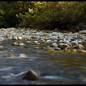
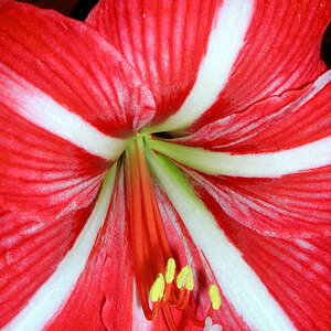
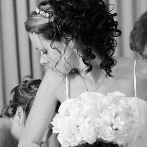
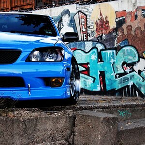
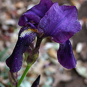
I am no Prince Hamlet but I very often find myself hanging on the edge of the overly saturated (heh) question on the thread title... to B&W or not to B&W?
I'll leave this one for y'all!


I will also love to hear your feedback on the shots!")
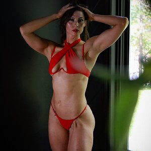
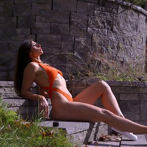
--,,--
Canon 70d + 50mm f/1.8
for those of you who saw my punching bag thread, this was shot using the same 2s exposure + manual flash "technique"!
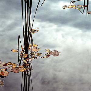
I'll leave this one for y'all!
I will also love to hear your feedback on the shots!
--,,--
Canon 70d + 50mm f/1.8
for those of you who saw my punching bag thread, this was shot using the same 2s exposure + manual flash "technique"!