giulio1993
TPF Noob!
- Joined
- Jan 4, 2011
- Messages
- 78
- Reaction score
- 5
- Can others edit my Photos
- Photos NOT OK to edit
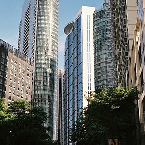
Someone told me that colors in this photos hurt eyes

Google image search gives me this result for "Museum Brandhorst":
http://www.isaacjulien.com/images/latest_news/4a3277915e057Brandhorst_Aufmacher_ar.jpg
(I guess I can't post images that are not mine so no problem if I post the link?)
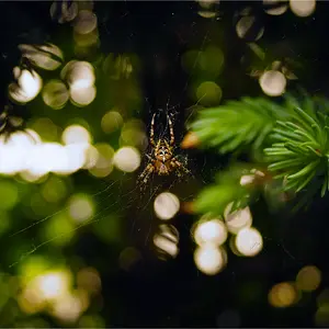
Are the color too vivid in the first photo (I setted the vibrance level to about 80%) ?
Which one do you prefer?