Yes to the second. Something was bothering me a little when I looked at the first and I think you got it. A little mysterious and perfectly exposed and processed.
Agree ^^ I prefer the second, but the left wall verticals are a little distracting (but I do know these old buildings could actually be leaning like this IRL )
An oddity on my part, partly because I just finished a discussion with someone on how titles work to the image. I cannot see this as "Toward the Unknown." I could perhaps see it as "Leaving the Safety of the Light," "The Road Taken," or whatever but the man is wearing his Kippah and I would be highly suspect if he hadn't traveled this path many times in his past. So, for me, the title doesn't make the photo work, at least in that aspect.
I do prefer the crop but might like to see a little vignetting to help draw the eye more toward the man and less to the surrounding buildings.
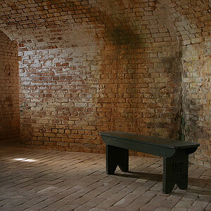
Sorry Peter, I'm afraid this one just isn't working for me. The discussion has been on the title but the photo it's self, seems flat, over exposed and leaning to the left. Sorry, it just isn't doing anything for me.
An oddity on my part, partly because I just finished a discussion with someone on how titles work to the image. I cannot see this as "Toward the Unknown." I could perhaps see it as "Leaving the Safety of the Light," "The Road Taken," or whatever but the man is wearing his Kippah and I would be highly suspect if he hadn't traveled this path many times in his past. So, for me, the title doesn't make the photo work, at least in that aspect.
I do prefer the crop but might like to see a little vignetting to help draw the eye more toward the man and less to the surrounding buildings.
Sometimes I fall off the wagon with my titles..but mostly they fit. I'm really getting into the concept of "Untitled" and letting the viewer decide.
Whose silly arse did you hurt? I have no recollection of such an event. I think at some point, everyone pees on someone else's parade around here. It's the nature of the beast in the forum style communication. Anyone so thin skinned as to let a comment by someone on here affect their lives...needs a new one. :lmao: Geeze, Louise!
Interesting shot, I like it. Maybe it's my laptop monitor, but it looks like the foreground is a bit overexposed, but not too bad.
I find that more often than not the "titles" make me cringe rather than add to my enjoyment of a photo, but that's just me. Having an ability to come up with a title that doesn't come across as pretentious is a talent in itself.
Then there are those (many) who say titling your piece "untitled" is pretentious. I agree...titles are difficult and often pointless. Personally, I think if you don't have a good title or feel you're forcing one, you're definitely better off going with untitled. Sometimes I just take the name of the image as it was downloaded from the camera. Especially abstracts. For instance "img_23." However, people like narrative. I know I do. A title gives you that, at least in part. I always look for the title. And a good one can indeed add a positive dimension.
As for this image, I think the title is a tad grandiose. Maybe something simpler like "A Bend in the Path." Or just "A Bend." When possible I like to keep titles simple and allow the viewer's imagination to fill in or add to the narrative. Of course it's always better to hope they just enjoy the photograph for what it is.
I like the mood and composition here, but this is way overexposed. Focus is off. I think the crop is no better than the original. Just different.
I don't want to agree nor disagree with any of the points raised, so that any new comments can be posted openly and candidly. I'll let the photo speak for me. However, it seems to me that the people who have taken the time to post their views deserve to be acknowledged. Thanks for all the comments.

") )
)
![[No title]](/data/xfmg/thumbnail/33/33027-0118cfc4034a37ef267ca6f8aa2fe04a.jpg?1619735841)


![[No title]](/data/xfmg/thumbnail/33/33028-42917987307dfd2eb37ddccec6dcb655.jpg?1619735842)