Trash the Dress & Bridal - C&C Please

AJev

TPF Noob!
Joined
Jun 14, 2012
Messages
23
Reaction score
1
Location
Texas
Can others edit my Photos
Photos OK to edit
Hi all! I'm an amateur who is working very hard to try and move into the professional category and hope to be a Portrait and Wedding Photographer. Below are some shots that I would really like a professional opinion on. My family and friends all say they look professional (which of course they would say that), and to be honest, I think they are pretty darn good myself, but I would really appreciate some feedback from actual professionals as well. Am I getting there? What should I work on? I know, they look like several different people shot them - I am working on nailing down my "style" - but how are they otherwise? I can take it...I truly appreciate your honesty and thanks for your time!

Trash the Dress & Bridal

#1
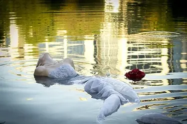
$DSC_0576.jpg

#2
$DSC_0593.jpg

#3
$DSC_0603.jpg

#4
$DSC_0532.jpg

#5
$DSC_2708a.jpg


#6
$DSC_2740.jpg


#7
$DSC_0452.jpg


#8
$DSC_2615.jpg
 
Haha! you were able to get the bride in the water! The vignetting doesn't look appropriate for some of these pics I quite like the composition though
 
I'm just a noob but here are my opinions
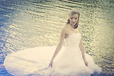
pic one.. the bride is lost in the reflections of the house, cropped closer maybe...
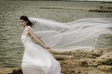
2. very muscly neck ... she seems stressed
3. I like it but its a little flat...
4. Nice pose but the blue tinge is distracting
5. Would look better as a 3/4 cropped shot as you cannot see her feet and the b/g is a little boring
6. She is having a "run forest moment" ...be careful of crooked horizons
7. Nice pose .. but the stronger highlights at the top of the image lead the eye away from the bride
8. She looks like she is floating...

my 2cents
 
Well first of all your samples posted are way too small for my eyes. The compositions all seem uncoordinated and poses forced, save the last one. Selective color? #5 has real potential but the processing is horrid, my honest opinion. I've seen worse but I wouldn't say these are worthy of sale.
 
Haha! you were able to get the bride in the water! The vignetting doesn't look appropriate for some of these pics I quite like the composition though

I agree on the vignetting and have been trying to stay away from it in my other work. I was concerned about composition though so I'm glad to know composition is ok. :wink:
 
I'm just a noob but here are my opinions
pic one.. the bride is lost in the reflections of the house, cropped closer maybe...
2. very muscly neck ... she seems stressed
3. I like it but its a little flat...
4. Nice pose but the blue tinge is distracting
5. Would look better as a 3/4 cropped shot as you cannot see her feet and the b/g is a little boring
6. She is having a "run forest moment" ...be careful of crooked horizons
7. Nice pose .. but the stronger highlights at the top of the image lead the eye away from the bride
8. She looks like she is floating...

my 2cents

#2,Wow, I never noticed the neck muscles, I'm glad you pointed that out. #4,Blue tinge, yes it is a bit overpowering I guess. #6, I never noticed the crooked horizon on this one, and I usually watch that - thanks for pointing that out.
 
Well first of all your samples posted are way too small for my eyes. The compositions all seem uncoordinated and poses forced, save the last one. Selective color? #5 has real potential but the processing is horrid, my honest opinion. I've seen worse but I wouldn't say these are worthy of sale.

Sorry about the sample sizes, I need to look up how to make them bigger. Yes, compositions are not coordinated as these are all former brides doing a favor by posing for me so I could practice composition, processing, on location lighting,etc. That aside, individually, are the compositions okay? Last one is not selective color, does it look like it is? On number 5, do you think it should be cropped closer since I cut of the feet?
 
Binga63, is this better on the crop?

$DSC_0576.jpg
 
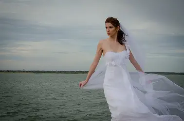
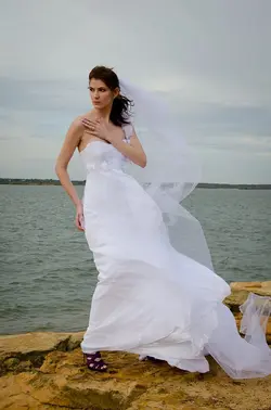
Trevor1t - I removed the processing from #5, and included 2 more from that set of that images to show coordinating images (there were 20-30 in the set) - is this better?

$DSC_2708tpf.jpg$DSC_2711tpf.jpg$DSC_2738tpf.jpg
 
2. very muscly neck ... she seems stressed

If you tilt your head back and smile can you not notice the muscles? ;) Impossible.

Nice set, the first one is very good in my opinion...

Generally i think you need to pay attention if the vignette is appropriate to the photo, and if the picture underexposed ;)

Not a professional opinion, but i think we are here to learn and I hope my opinion might be useful :thumbup:


Keep your good work :wink:
 
I think it is the separation of the bride and the water ... there is none... you tend to lose her... i had a play.. if you hate them tell me i will delete:)
 

Attachments

  • $DSC_0576-2.jpg
    $DSC_0576-2.jpg
    128.8 KB · Views: 173
  • $DSC_2708tpf-2.jpg
    $DSC_2708tpf-2.jpg
    130.3 KB · Views: 182
Trevor1t - I removed the processing from #5, and included 2 more from that set of that images to show coordinating images (there were 20-30 in the set) - is this better?

View attachment 14156View attachment 14157View attachment 14158

I personally like the last one here. The pose is simple, the horizon isn't centered or almost centered, the veil is prominent, etc... Number 8 in the first post is good also.

In general they all seem to be a little muted to me. By that I mean they are cold, dark and could use some pop. Think of bringing in detail in the clouds in the background, use the light more, and think if bringing more attention to the bride with some more direct light and use some shallower DOF.
 

Most reactions

New Topics

Back
Top