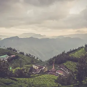
1. Looks a tad bit underexposed, but I like the idea. I think the composition is pretty good, but I might have tried to include more of the buildings, personally.
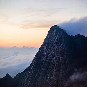
2. Nice shot, I can't find much to nit pick about. Would have been nice if the sky had cooperated a bit more and been a bit more interesting.
3. This is an interesting shot, but as someone else said, the subject blends with the background. I think extra blurring of the background probably won't help this. Since you went B&W with this one, the tones just end up blending together. In color, the subject would likely stand out better. Also, with a different composition (still in B&W) you might be able to seperate the subject from the background just by having background on both sides of subject. Instead, this just has a kind of gradient feel that blends together.
4. Nice composition. It seems a bit dark, but that could be my monitor (I'm at work on an uncalibrated monitor). I see very little detail in the statue except for the very top and the foreground plants are missing detail also. (Again, this could be due to my monitor here).
5. Nice shot of the lizard. I personally might like to see a closer crop, but that's a personal preference.
6. Although there's nothing technically wrong with this shot, it doesn't really do much for me.



 I used to live in cancun. Now I'm a exchange student in Minnesota.



![[No title]](/data/xfmg/thumbnail/32/32635-be18e952e67667cbb1525b4b057b6423.jpg?1734162121)


![[No title]](/data/xfmg/thumbnail/39/39480-e4e26ffe5c6148262ac81eff975a5c0e.jpg?1734173580)