What's new

Two Hours of Editing Plus Your Comments Yeilds This.. Comments and Critiques Please!

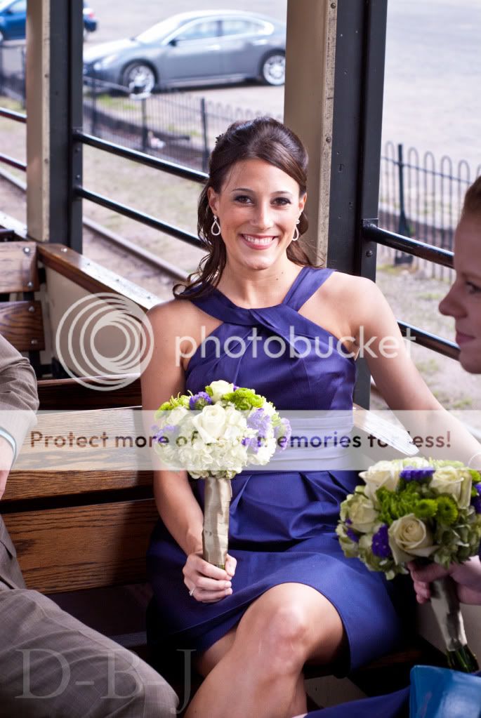
Why do you think this edit is flattering?

Because it is. It has more contrast, slightly sharper, removes unnecessary things that i didn't realize were in the shot, puts the center of focus on her, etc.
 
So you like the color cast and the flatness that you've given to the photo? I know you have invested a lot of time in the cloning of this image, so maybe you feel like you have to defend it to the grave, but if this was a paying wedding job I hope that you can step back from your work long enough to ask yourself if you are doing the subject justice. I mean, congrats on cloning out a bunch of crap you could have shot around to improve what was essentially a snapshot. Congrats on pulling back some of the highlights you blew. However, it's not a very flattering color, you've sucked the beautiful detail of the color of her dress, the flowers, the natural light out and replaced it with what you think is "vintage". I have a sneaking suspicion that you chose this color edit because it hides more of the flaws in your cloning, which is fine, but lets call a spade a spade. If you're delivering your client MULTIPLE photos in this "vintage" style, you're wasting your time spending hours cloning out distractions. It's all well and good to practice your PS skills (don't get me started on "practicing" your skills on a paying client), but the end result is a little cringe worthy.

 
So you like the color cast and the flatness that you've given to the photo? I know you have invested a lot of time in the cloning of this image, so maybe you feel like you have to defend it to the grave, but if this was a paying wedding job I hope that you can step back from your work long enough to ask yourself if you are doing the subject justice. I mean, congrats on cloning out a bunch of crap you could have shot around to improve what was essentially a snapshot. Congrats on pulling back some of the highlights you blew. However, it's not a very flattering color, you've sucked the beautiful detail of the color of her dress, the flowers, the natural light out and replaced it with what you think is "vintage". I have a sneaking suspicion that you chose this color edit because it hides more of the flaws in your cloning, which is fine, but lets call a spade a spade. If you're delivering your client MULTIPLE photos in this "vintage" style, you're wasting your time spending hours cloning out distractions. It's all well and good to practice your PS skills (don't get me started on "practicing" your skills on a paying client), but the end result is a little cringe worthy.

Well, i don't need to defend it to the grave, and i thank you for posting your seemingly harsh comments in a sensible and intelligent was, giving me some insight in how to improve myself in the future. I'm used to the 'ol "this sucks but that's all i say" type stuff. So thank you and i shall think of that next time i shoot and edit.
 
Uh, did I miss something? You wanted critique, right? Frankly, I was being nice.
 
Uh, did I miss something? You wanted critique, right? Frankly, I was being nice.

I think he sincerely thanked you for saying in a very polite way, that he was polishing a turd.
 
I tend to agree with g-fi and bitter. I understand WHY it took two hours to edit this shot, but no one can tell. Looks like an overprocessed snap with a cheesy 'vintage' sepia-pink-sorta-whatever action put on it. You could have saved yourself two hours and composed the shot better and saved yourself the headaches of cloning. No way would I have spent 2 hours on that shot, sorry, but true.
 
Didn't see the previous thread, however this is what I note:

-The PP on this image is random, what is with the pinkish purplish cast? For some reason photographers seem to think random color cast is in... I guess sometimes unknowing clients may like it, however a professional editor would not generally do that. Sometimes you may include 1 photo with a desaturated / slight color cast, but this coloring is not complimenting to her features.

-I'm really not a fan of clipping at the elbow, I usually prefer to see a little more especially when the subject has her entire other arm in frame. The composition is just unbalanced

-On the topic of composition, there are several bad tangents passing through her head. All of which take away from the subject.

-There appears to be some level of halo-ing? I'm not even sure, camera left shoulder there is an odd hot spot. Could be from editing but I can't be sure.

Just some of my thoughts. I hate to say it but I don't see anything worth saving in this photo (as I see it right now). I'm not sure how much better or worse the original is, but this one I wouldn't really consider worth 2 hours of work.
 
next to her right shoulder you can tell where you overprocessed the pics and there is a halo occuring.
The halo was in the original as well. I think it might have been just odd lighting.
 
possibly. i used to get those alot from too much fill and clarity in cs4
 
next to her right shoulder you can tell where you overprocessed the pics and there is a halo occuring.
The halo was in the original as well. I think it might have been just odd lighting.

Yeah, the halo was from odd lighting. And in the original thread i critiqued myself harshly for cutting off her elbow. The original is this:
Susanunedited.jpg
 

Create an account or login to comment

You must be a member in order to leave a comment

Create account

Create an account on our community. It's easy!

Log in

Already have an account? Log in here.

New Topics

Back
Top Bottom