What's new

Two of a feather

unpopular

Been spending a lot of time on here!
Joined
May 17, 2011
Messages
9,504
Reaction score
2,004
Location
Montana
Comments?

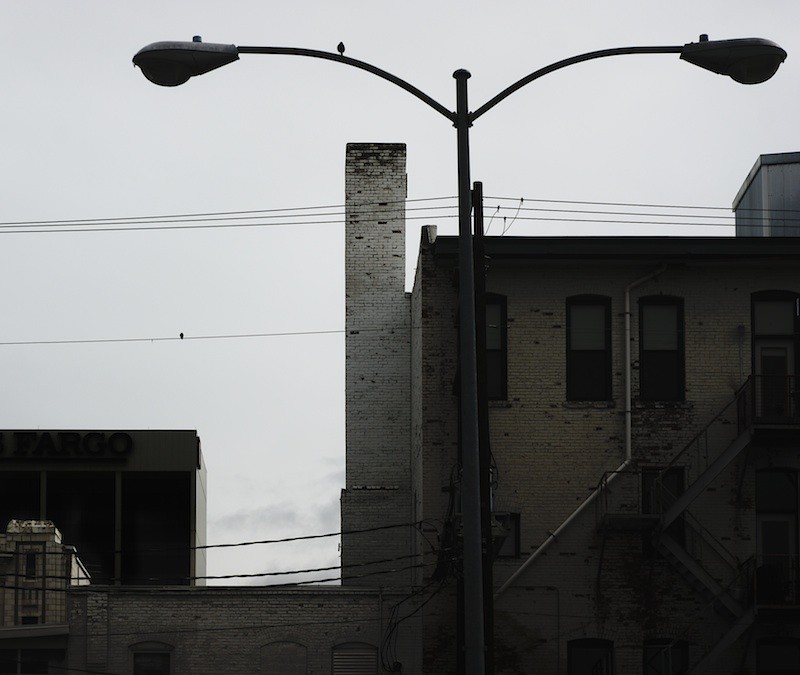
5733690329_02d9a7e88c_b.jpg
 
I appreciate your comments, Alvarez, though I am a bit curious what more fill would accomplish for this particular image? The original is lighter, but I felt that too much detail made the image overly busy, lost the early morning mood, and did not reflect what I saw and felt when I took the photo.

I am also unsure how well my monitor is calibrated. From my end, there is plenty of shadow detail, albeit darker than what some may prefer ...
 
I mean the fill light feature if you have Lightroom. You don't need to change the whole exposure of the picture if you play with this feature and the exposure plus brightness features. What kind of program you have?
Oh! and for calibrating your monitor try to use this program

http://www.calibrize.com/
 
I like the image as is. The darkness of it does set a mood to tell a story. It's intriguing.
 
Alvaz - Thank you for your reply. I am using Photoline32, but I don't use the equivalent tool much, I prefer just using curves and masks - more control, you know. The original is much, much lighter in tone and flatter in contrast. In the RAW file, you can clearly read the Wells Fargo sign on the tall modern building in the back. I maximized exposure to maintain flexibility, but this is not what I saw or felt when I took the photograph. I am not saying that just because I intentionally made the image darker than what was exposed that it is a successful image; but I am still unsure what benefit more fill would do for this particular image. The shadows, from my end anyway, do not appear blocked up, except in the Wells Fargo building, which I definitely didn't want to draw attention to.

I don't mean this as an insult to you personally, I don't want to discourage anyone from providing honest feedback, but I think that it's important that when we spot problems with an image to question if the problem is a problem of convention or taste, or if it's a problem in conveying the image. If I see something I don't like and can't answer, "this image would be better this way because..." then I sum it up to just a personal taste issue, and not an objective critique of the image concerning how to make it better.

 
Well then I misunderstood you. But I thought there were too many darks in the photo and loss of definition... but if my comment is a matter of taste instead of an objective critique, then don't mind me at all. :sexywink:
I like the composition anyways.
Have a nice day.
 
Last edited:
Thanks all. Maybe it is a calibration issue after all then, like I said, from my end there is a good degree of shadow detail, I was pretty careful to make sure things don't block up. I wish there was more detail in the lamp's lenses, however. It seemed like there was, I'l go back and look at the file later :) Thanks, alvarez for your comments, and I'm sorry if I came across as prickly.

cue- could you tell me where exactly you would place the crop?
 
NO problem, glad you realized it may have been in the calibration, you would be surprised how many pictures turn out to be very dark once you calibrate your monitor as I did. Any other ones? I really like the geometries involved in crowded architectural settings like a city or bridge.
 
cue- could you tell me where exactly you would place the crop?

Oh, sure! :) I think I'd try a vertical crop that left the birds at the opposite corners with a little bit of breathing room, but not much. With the original, there's so much there- and the second bird is so small- that my eye wandered a little before finding the subject. The buildings are interesting, but if the birds are your subjects, I think a different perspective would give them the attention they deserve. JMO, to be taken with a tablespoon of salt!
 
:oops: Birds? Oh my! :banghead: I know by the title but couldn't tell by the picture. The lamp posts take all the attention -which I don't mind at all.
 
Hello there, your image is a little bit confusing. But very creative title and I like it! I recommend, you soften the background and let the outpost be the main attraction. Keep on posting! :)
 
Well, the birds aren't really the subject at all and the title has more to do with my overall intent, which has to do more with the placement of things.But ive found that discussing such esoteric topics seems to off put some people. So if you're into those sorts of things, feel free to pm me.
 

Create an account or login to comment

You must be a member in order to leave a comment

Create account

Create an account on our community. It's easy!

Log in

Already have an account? Log in here.

Back
Top Bottom