noob myself, so, get your grain of salt out
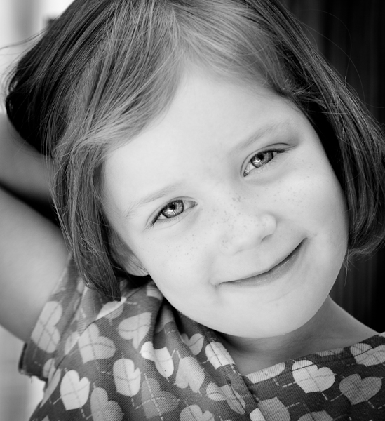
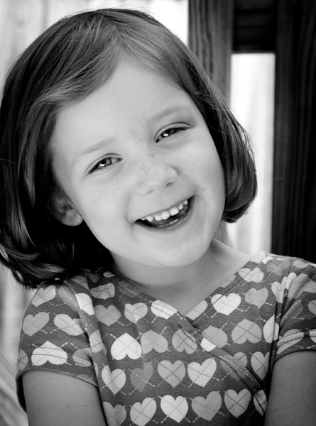
I like the right one better. The left one is way over exposed and looks strangely two dimensional - her nose and eyebrows melt into her face!
The right one is very sweet, you can see her freckles, nose, eyebrows - all of the details that were blown out in the left one.
I agree with Raizels, also the one on the left looks like a forced smile and makes it a bit less appealing. The right picture is significantly better than the left.
No improvement necessary! But if I have to make suggestions: the background in #2 may be too in-focus; try giving her something to do - like catch her looking up from working on a coloring book, or baking cookies.



![[No title]](/data/xfmg/thumbnail/42/42460-80970c44cc9fb42dd0c86d08e7bc401d.jpg?1734176997)



![[No title]](/data/xfmg/thumbnail/39/39479-b21bb968588fb225cd453013c6512c9a.jpg?1734173577)