here are just the thoughts I had:
 8206739962_e82ebfb27b_k
 by
franklinrabon, on Flickr
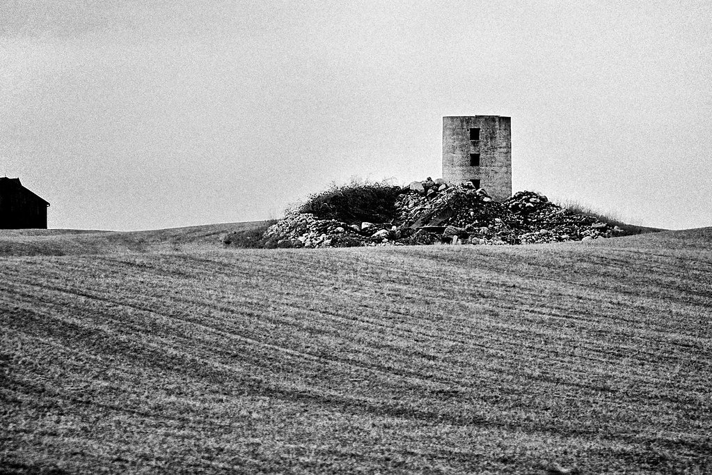
Here, I thought the building on the left saved the image. The original suffered from an issue of either being dead center, and statically boring, or being put in a traditional 1/3 line, but then being unbalanced, since there is nothing on either side of the original to balance it if it's off center. After seeing the other building, I saw it as an opportunity to give a balancing point, allowing me to off center the main defunct silo. The dark building adds a hint of mystery, and even though it's small in the image, the fact that it's so far to the left, and so dense and mysterious allows it to balance out the larger main subject. Given the mood this created, I thought a very contrasty, grainy old film type look would work best to convey the atmosphere.
 8206745368_6e53a05cc8_k
 by
franklinrabon, on Flickr
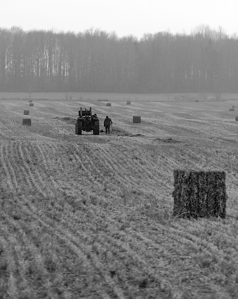
In the second image, I thought the key compositional tool were the implied lines of the bales of hay. Their implied convergence, and constant reference size, plus the atmospherics of the image give it a sense of depth.
The one upfront, plus the tractor form a powerful 1-2 punch giving the viewer a sight line to trace. When you add in the two bales on either side of the tractor, you get a pretty powerful triangle, which gives the image a nice sense of order.
The biggest drawback to the second image was DoF wise, it was neither deep enough to have everything in focus, nor shallow enough to use focus as a compositional tool. You sort of have the upfront bale disconcertingly 'almost' in focus, but I couldn't really do much about that, other than gaussian blur, which just looked terrible. So, DoF had to be left as is.



![[No title]](/data/xfmg/thumbnail/32/32930-09414fc020c2a60a456ff59a05c5ef8f.jpg?1734162706)
![[No title]](/data/xfmg/thumbnail/38/38443-d3f00036791c5f915b132320c9ac8865.jpg?1734172307)