willpops
TPF Noob!
- Joined
- Apr 17, 2006
- Messages
- 137
- Reaction score
- 0
- Location
- France
- Website
- willpops.neuf.fr
- Can others edit my Photos
- Photos NOT OK to edit
Frenchy boy is back. Sorry for you all 
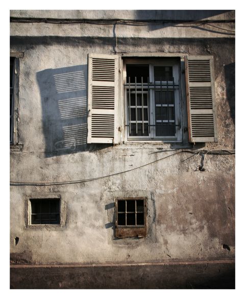
162.
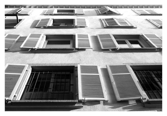
163.
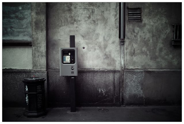
164.
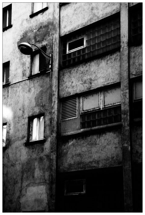
165.
166.

168.
169.
170.
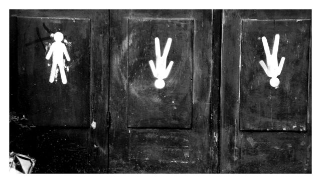
171.
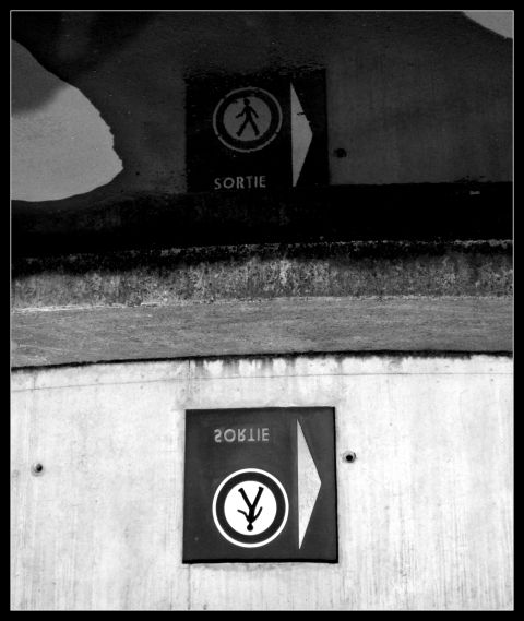
("exit")
162.
163.
164.
165.
166.
168.
169.
170.
171.
("exit")