1. I don't get it.
2. tones not so good.... shooting in the sun is either hit or miss....you missed. it is to harsh. You need a filter to soften it. It looks over sharpened as well.
3. looks like a snapshot with no depth.
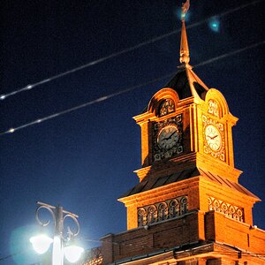
4. Great idea but needs a better angel. Needs to be closer and have more detail. The sun kills this shot. The birds flying around the tower is a good concept but it needs to be composed better. You have an eye but need to focus it (no pun intended)
Keep on shooting and you will gradually get better with time.
1. I don't get it.
2. tones not so good.... shooting in the sun is either hit or miss....you missed. it is to harsh. You need a filter to soften it. It looks over sharpened as well.
3. looks like a snapshot with no depth.
4. Great idea but needs a better angel. Needs to be closer and have more detail. The sun kills this shot. The birds flying around the tower is a good concept but it needs to be composed better. You have an eye but need to focus it (no pun intended)
Keep on shooting and you will gradually get better with time.
It's interesting how perspective varies. None of these will win awards for technical perfection but I didn't feel that was the point with #2 and 4.
I would agree that the light in #2 is harsh but I think the sunlight and high contrast is what defines the image (for better or worse, I suppose). I would be curious to know what kind of PP was done, how much sharpening?
In #4 I think the sun IS the shot. I think the composition has some merit, although not perfect. The diagonal tower pointing to center and the position of the birds gives a precarious sense of balance. I would alter the framing to eliminate the empty space between the tower and the left edge of the image, perhaps moving closer and filling more of the frame with the tower.
I shot all of these with a basic SONY DSC-W200 and did some simple post work. Sure this isn't pro stuff but it's all part of the process.
The photos were from my trip to Italy and while they don't exactly have a specific meaning behind them, I wanted to capture everyday situations while in a different setting.
IMO, I only really like 4.. the others seem kind of snapshotty and kind of lack the artistry.. The concept behind 4 is great, and is well done.. The only thing I ask is what's up with the bird on the left? It looks like there's a big burn mark there or something..
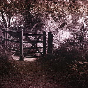
I like #4 the best. The other ones seem a bit snap shot-ish. I really enjoy the tones and contrast in the first two shots, but the first one doesn't really hold my eye. The second one would be very cool if you were maybe a little farther from the person so the line of the path lead to them to sort of draw my eye into the photo and to the subject. The third shot just looks like a snap shot, so while it's a cool scene, it doesn't really convey that to the viewer.


![[No title]](/data/xfmg/thumbnail/35/35265-c9ea3efd2c618a57ea136e63ad106880.jpg?1619736970)