What's new

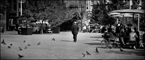
Walking Man

I like this image even though I have some issues with it. I think you were going for a framing effect on your subject, but your right hand frame is far too busy and draws attention from the gentleman walking away. I personally like busy images, I like examining the layers of life that are happening here.

I really like that if you strech your imagination slightly, the Walking Man is the guy who stood up and walked out of that empty wheelchair.
 
I like this image even though I have some issues with it. I think you were going for a framing effect on your subject, but your right hand frame is far too busy and draws attention from the gentleman walking away. I personally like busy images, I like examining the layers of life that are happening here.

You echo many of my feelings regarding this image. Flawed, but still interesting is how I see it. The biker bugs me a lot.
I get the imbalance you mention. I wanted to clone out the PARK sign on the left, but I felt it would increase the sense of heaviness to the right of the frame.

I really like that if you stretch your imagination slightly, the Walking Man is the guy who stood up and walked out of that empty wheelchair.

Glad I wasn't the only one that saw that. ;)

Thanks again for your insights.
 
You COULD edit biker man out.

Nice image, but it's one of those that would be hard to appreciate without it being printed HUGE.
 
I think it's interesting, too good to pass up with a subject like that walking down the street. That little parking sign being bright caught my eye too, but it's a nice photo.

I might play around with cropping some copies and see what else might work. I like the group of people at the tables with the umbrellas I might just crop to get the edge of someone and the leg sticking into the right side, out of the frame.

As far as the left side, I've sometimes had to grit my teeth and crop out something I didn't really want to lose (like in this, some of the birdies!) but in the end sometimes it cleans up my composition and works better (if I can make myself let go of something I don't really want out of my picture!). I'd probably try some different versions of it and see.

I like this in B&W, lots of nice patterns that work well I think.

 
$p233315567-6.webp

There is no biker. There is only Zuul.

BTW, looking at this even on my PC in full screen made me fall in love with the shot.

It is also sliiiiiiiiiiiiiiiiiiiiiiiiiiiiiiiightly tilted, I believe.
 
Very nice edit rabbit. :)

Thanks all!
 
I really like this image, I don't think the sign(I think the white of the sign is ballanced by the blacks in the rhs foreground) or the cyclist detracts from it. It's a picture of life and life isn't perfect. The guy walking away creates enough interest for me to return my eye to the frame and I like the expanse of the shot. It kinda adds to the big urban feelling making it feel closed inbut wide open at the same time.

Good job!
 

Create an account or login to comment

You must be a member in order to leave a comment

Create account

Create an account on our community. It's easy!

Log in

Already have an account? Log in here.

New Topics

Back
Top Bottom