Wanna Play: " Hop skip and Jum..." ?

Jasii

No longer a newbie, moving up!
Joined
Jun 17, 2015
Messages
470
Reaction score
171
Location
Dharamsala, Himachal Pradesh, India.
Can others edit my Photos
Photos OK to edit
Dear Friends,
Could think of no better title for this :)
This one was taken almost a year ago when I had just begun to cuddle a camera. Dug this one out and posting with minor crop and a wee bit of sharpening. The good thing of posting here is, having access to so many eyes which is a 'Godsend' and a great learning curve. Would be nice to hear some critique and opinions.
Cheers!
Jasii
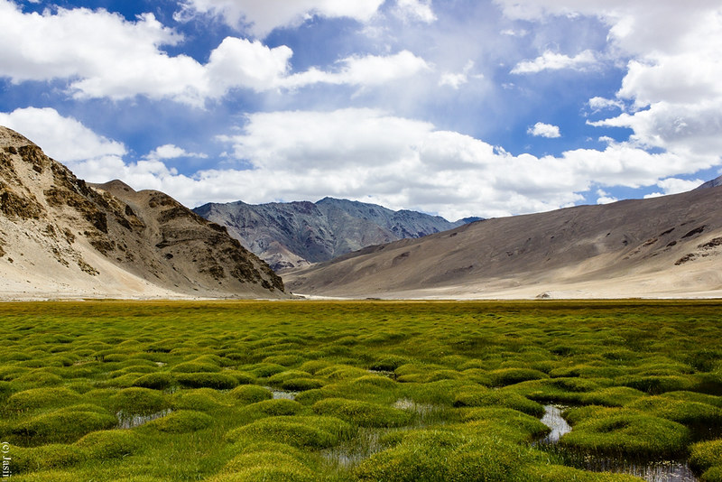
Wanna play 'Hop Skip and...'- by jasiiboss, on Flickr
 
Last edited:
Volume, value and balance. An area in the image has volume, that volume has a value (brightness), colour and texture (contrast). By having much the same contrast the 3 volumes in the image can appear more stacked vertically than give the illusion of depth, by making the grass and sky equal in area the mountains can be reduced to just a small boundary layer, and by having the sky as the brightest area it can draw the eye.

So, just as an experiment, what happens if you mix things up a little so the sky has less volume and value than the grass and balance the sky with the mountains?

mod-1.jpg
 
These are strictly my own personal opinions, so please take them as such.

Over all, I really like this image...it almost has a New Zealand-like quality to it that gives me thoughts of Lord of the Rings. The two things that catch my own eye are the clouds and the color.

Looking at the clouds, particularly towards the center there there's a bit of light, semitransparent clouds that almost look more like smoke. Personally, I find it a bit distracting and I think it detracts from those lovely blues in the sky. If I were doing a reshoot, I'd wait for a slightly better "moment"...and I'd probably use either a polarizer or even a graduated ND filter. I love the thick clouds that are more off to the distance and the contrast they provide with the sky, but that light stuff...I don't think it ruins the image per say, but I could do with out it. If it were me, I'd likely try to clean that up a fair bit using the clone and/or the healing brush tools.

The color on the other hand...I'll admit that it's been a while since I calibrated my monitor, but the foreground there looks pretty yellow and if this is actually some marsh or something, my would expect deeper, richer greens. If this is the way the scene actually looked and you like it, so be it, however personally I'd take this into Photoshop, separate the foreground into it's own layer, add a saturation layer, bump the yellows down a fair tich and darken up the greens. I also might boost the over all saturation a little more, that's more a personal taste thing on my part....I tend to prefer richly saturated images. There's also an area there towards the horizontal center that's a bit more reddish that doesn't quite look natural to me.

Again I do like the image, but if it were mine, I'd probably do some extra post processing there to clean those things up a bit...

Just my $.02 worth.
 
Volume, value and balance. An area in the image has volume, that volume has a value (brightness), colour and texture (contrast). By having much the same contrast the 3 volumes in the image can appear more stacked vertically than give the illusion of depth, by making the grass and sky equal in area the mountains can be reduced to just a small boundary layer, and by having the sky as the brightest area it can draw the eye.

So, just as an experiment, what happens if you mix things up a little so the sky has less volume and value than the grass and balance the sky with the mountains?

View attachment 109143
Sorry Tim! Hasn't sunk in yet. Am trying to visualise what you are trying to convey. :confused-55::confused-55::confused-55:
The way you explain, the horizon line goes towards a more central placement. Would that technically be more correct?
 
These are strictly my own personal opinions, so please take them as such.

Over all, I really like this image...it almost has a New Zealand-like quality to it that gives me thoughts of Lord of the Rings. The two things that catch my own eye are the clouds and the color.

Looking at the clouds, particularly towards the center there there's a bit of light, semitransparent clouds that almost look more like smoke. Personally, I find it a bit distracting and I think it detracts from those lovely blues in the sky. If I were doing a reshoot, I'd wait for a slightly better "moment"...and I'd probably use either a polarizer or even a graduated ND filter. I love the thick clouds that are more off to the distance and the contrast they provide with the sky, but that light stuff...I don't think it ruins the image per say, but I could do with out it. If it were me, I'd likely try to clean that up a fair bit using the clone and/or the healing brush tools.

The color on the other hand...I'll admit that it's been a while since I calibrated my monitor, but the foreground there looks pretty yellow and if this is actually some marsh or something, my would expect deeper, richer greens. If this is the way the scene actually looked and you like it, so be it, however personally I'd take this into Photoshop, separate the foreground into it's own layer, add a saturation layer, bump the yellows down a fair tich and darken up the greens. I also might boost the over all saturation a little more, that's more a personal taste thing on my part....I tend to prefer richly saturated images. There's also an area there towards the horizontal center that's a bit more reddish that doesn't quite look natural to me.

Again I do like the image, but if it were mine, I'd probably do some extra post processing there to clean those things up a bit...

Just my $.02 worth.
Thanks Jim for the meaningful insights, appreciate it.
1. No Q of a reshoot as the locn is a couple of 1000 kms away. :)
2. I think that smoky cloud was my own doing, I did have a cpl strapped on, maybe improper usage of the same did me in.
3. Have not tweaked the colors at all, what you see is what I saw.
Kind Rgds,
Jasii
 
Sorry Tim! Hasn't sunk in yet. Am trying to visualise what you are trying to convey. :confused-55::confused-55::confused-55:
The way you explain, the horizon line goes towards a more central placement. Would that technically be more correct?

No, stop thinking of lines and think of areas:

mod 2.jpg


In your image above Area 1 (the sky) is roughly equal in volume to Area 3 (the green grass) and Area 1 is the brightest.
My eye is drawn immediately to the biggest and brightest area, Area 1 is the most prominent. So what if you changed this as an experiment to see the effects?

mod 3.jpg


In my edit Area 3 (the green grass) is the biggest and brightest. Area 1 (the sky) is equal in size to Area 2 (the mountains). Now look back at the originals and see how the prominence has changed for each of these areas. Also in the images split into areas see how the illusion of depth is altered, does each area look the same or do some seem closer?

Lines, such as the horizon line don't exist, if you walked up to it you wouldn't see a line at all. It is just a boundary between two areas of the image that have different brightness, colour and contrast. It's the area of grass that has colour, brightness and contrast not the imaginary line between it and the mountains. So think about balancing the areas, not just the implied lines in an image.
 
Last edited:
You've been given a real gift in the C&C on this image.
 
Tim, thanks for your discussion of the OP's post, You have given me a different way to look at landscapes.

WesternGuy
 

Most reactions

New Topics

Back
Top