Navigation
Install the app
How to install the app on iOS
Follow along with the video below to see how to install our site as a web app on your home screen.
Note: This feature may not be available in some browsers.
More options
You are using an out of date browser. It may not display this or other websites correctly.
You should upgrade or use an alternative browser.
You should upgrade or use an alternative browser.
Washed Up
- Thread starter ceeboy14
- Start date
amolitor
TPF Noob!
- Joined
- May 18, 2012
- Messages
- 6,320
- Reaction score
- 2,131
- Location
- Virginia
- Can others edit my Photos
- Photos OK to edit
Hmm.
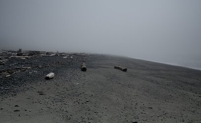
I'm struggling to make something of this. The three logs in the foreground are almost well arranged, I think. They look "natural" without looking random. They do seem to direct the eye to nowhere, which is an unfortunate side effect. I like the curve of the "horizon" line, and I like that it appears to start as sea-shore and end as a fog line.
There are elements here I like, but it's not pulling together to make up an appealing picture, or a picture that particularly tickles my brain in an interesting way.
KenC
Been spending a lot of time on here!
- Joined
- Jan 18, 2010
- Messages
- 5,700
- Reaction score
- 1,472
- Location
- Philadelphia
- Can others edit my Photos
- Photos NOT OK to edit
Dark and gloomy, and therefore fairly interesting to begin with. However, to me it seems unbalanced in an unsatisfying way, with very little on the right side. Cropping to put the rightmost log almost on the frame edge would work better for me.
I agree with Andrew that the three logs direct one to a convergence point where there is nothing, but that seems to fit this image.
I agree with Andrew that the three logs direct one to a convergence point where there is nothing, but that seems to fit this image.
Most reactions
-
 215
215 -
 190
190 -
 185
185 -
 184
184 -
 174
174 -
 155
155 -
 143
143 -
 127
127 -
 123
123 -
 94
94 -
 78
78 -
 78
78 -
 76
76 -
 75
75 -
I
67

