I think both of these would have looked better if the subject wasn't almost bang in the center. I think you've gone too far in PP as well. That pink tends to get out of control when you contrast too much. Maybe dial back on the sharpening/contrast and recrop and it'll be a much more pleasing image
Are you happy with a nice sharp clear record of a beautiful object? In that case, these are lovely. They are lovely because the flower is lovely. And it is a lovely picture, I am not being in the slightest bit facetious.
However.
If you wanted a beautiful photograph that happens to be built around a beautiful object, you're a ways off. The light's not bad in either one, but light somewhere between the two would be better -- neither harsh as in the first nor relatively flat as in the second (although the second is quite nice, perhaps a bit of tonal curve fiddling...)
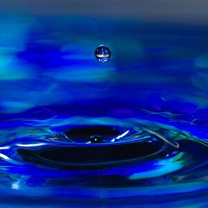
Then you want to place the mass of the flower in balance with something else. Some negative space, an appealing leaf. A contrasting shape like a stick might be a nice idea. That dark masses of water in the first one are a form that could be better exploited. You could place the flower (on one side of the frame) in balance and contrast with a dominant large mass of dark water opposite, with some means of visually connecting them. Perhaps a bud murkily seen under water, or some visual line from one to the other, or a bright reflected spot in the middle of the larger dark mass echoing the brightness of the flower.
That's just a random assemblage of ideas. Pull anything you like out, and throw the rest away, up to and including all of it.


")

![[No title]](/data/xfmg/thumbnail/31/31742-596f6bbc60b2ba7fed2cd25f5aacf41c.jpg?1619734985)


