Waterfall - Honest feedback wanted.

m1a1fan

TPF Noob!
Joined
Aug 21, 2007
Messages
297
Reaction score
0
Location
Lake In The Hills, IL
Can others edit my Photos
Photos NOT OK to edit
All,

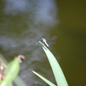
Alright, I finished processing this photo using Paint Shop X2 today and would like some honest feedback on it. It was converted from Nef to Tiff under Paint Shop and then saved as a jpeg so I could post it here.

What do you think..

To dark?
To light?
Water looks blown out?
Oversharpened?
Not sharpened enough?
Crappy composition?

Anything else?

I'm looking for constructive criticism so have at it. I don't get offended easily.
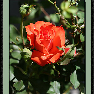
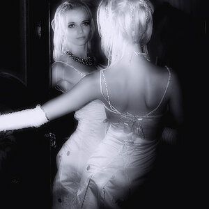
WaterfallReview.jpg
 
Gee, I think it is done very well. I like it it, it's pleasing to eye and I spent a good bit looking it over which tells me it is a good pic.
 
Gee, I think it is done very well. I like it it, it's pleasing to eye and I spent a good bit looking it over which tells me it is a good pic.

Thanks uplander for your feedback. I appreciate it.

I added the image to a canvas with borders. I think it helps make the image stand out more.

ChicagoBotanicGardensFramed.jpg
 
Very nice :) The border does make the pic stand out a bit more also.

The only thing I would say is in my opinion maybe it just needs a tad more contrast (and maybe a little bit of brightness) but everyones tastes are different so others & yourself may not agree there.
 
Very nice :) The border does make the pic stand out a bit more also.

The only thing I would say is in my opinion maybe it just needs a tad more contrast (and maybe a little bit of brightness) but everyones tastes are different so others & yourself may not agree there.

See I disagree there, not everything needs to bright and well defined. Look at the setting . It's a waterfall under a canopy of trees. It should be dark and mysterious ,Making you look a little deeper to see everything the photo has to show.

The essence of a photo is to capture the view as it appears to the cameras eye, not to enhance it so everthing is there in crystal clear detail.

But that is just my personal preferance, so take that with a grain of salt:lol:
 
The border is neither here nor there for me as it's your personal taste.

On the shot, I think your shutter speed couldn't have been better. Very nice silky smooth water. There are a few points where the highlights are a bit blown out, but in the overall, I don't think the feel would be the same with a faster shutter speed.

It looks as though there is waterflow that continues from the bottom right of the picture. Personally, I would like to see what a shot would look like with your PoV a couple or three steps to the right and lowering yourself enough to miss that damn limb that's crossing in the upper right. This would possibly move the top of the falls further to the top left and the downstream still exiting bottom right. Probably would have been easier to say that it looks a bit centered.

Regardless, nice shot and thanks for sharing.
 
Very nice :) The border does make the pic stand out a bit more also.

The only thing I would say is in my opinion maybe it just needs a tad more contrast (and maybe a little bit of brightness) but everyones tastes are different so others & yourself may not agree there.

Miaow - Thanks for taking the time to comment. I appreciate it.

The border is neither here nor there for me as it's your personal taste.

On the shot, I think your shutter speed couldn't have been better. Very nice silky smooth water. There are a few points where the highlights are a bit blown out, but in the overall, I don't think the feel would be the same with a faster shutter speed.

It looks as though there is waterflow that continues from the bottom right of the picture. Personally, I would like to see what a shot would look like with your PoV a couple or three steps to the right and lowering yourself enough to miss that damn limb that's crossing in the upper right. This would possibly move the top of the falls further to the top left and the downstream still exiting bottom right. Probably would have been easier to say that it looks a bit centered.

Regardless, nice shot and thanks for sharing.

Kundalini -

Thanks for the critique. There were a couple trade off's I had to make to get this shot. The image is a bit centered, but if I would've composed a bit differently I would've lost more that small bit of the falls second from the top. I think having that small part of the falls in there helps lead the viewers eye down the falls.

The dreaded limb. There was more to it that was cropped of the top of the image and some of it was cloned out. Shooting lower might have helped and I'll try that when I get back out there.

In the lower right corner of the image, the water actually exits under a small rock walkway that is surrounded by asphalt. It certainly isn't very appealing which is why it wasn't included but I still attempted to give the water "an exit" and framed it between the two rocks.

This was a tight area to shoot in. The little walkway in front of the falls is about four feet wide and surrounded with gardens which is a no-go area for people and tripods.

So to sum up my long winded response, I'm not making excuses just breaking down what I did and why I did it. Ya, it might have been easier to say it looks a bit centered, but I like to read a breakdown of what someone thinks as it gives me ideas for the future.

Thanks again! :thumbup::)
 
After reading the constraints you were dealing with...Well Done.

My comments were from the disadvantage of not being there. Your response in no way resembles an excuse, but as you stated, a breakdown of what and why. :biggrin:
 
Hi m1a1fan

I see you said "My photos are Ok to edit" so I thought I would have some fun.

I really hope you dont mind, but I was just in the mood to play around and your photo grabbed my attention.

I do NOT think that my photo version is superior in any way - I think you did a great job. In fact my edited version is way over the top - would never work!!

Here it is though!

waterfall.jpg


And here is a version more suited to my own taste (personal preference)

waterfall2.jpg

Ya, that first version is way over the top. The second one is a bit to contrasty and dark for my liking but that's just me. I think detail in the rock begins to get lost in the shadows.

I tinkered around with the contrast settings on this when I was editing and what I came up with is what I'm happy with.

It's interesting to hear what people think though.

Thanks for commenting :D
 

Most reactions

Back
Top