Weekly challenge 3/23 - 3/29 In Living Color

It is amazing the different colors that appear when the sun starts to rise. I got up before dawn on Sunday and was able to capture this photo.
Sunrise 3 - LD (1 of 1).jpg
 
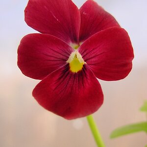
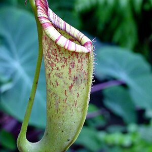
At the moment we've 3 different types of orchid that are in bloom, I'm not a "flower photographer" but I didn't want to skip this one.
It's a quickie from this morning before we had our coffee. Diffuse daylight through the kitchen window and just a white A4 to illuminate some shade. For the background I've taken a gray, cardboard, envelope and as a final action I've made a transparent green layer in post to make the background darker and more harmonious with the subject.
Fuji XE1 + 18/55mm - tripod

View attachment 170671
 
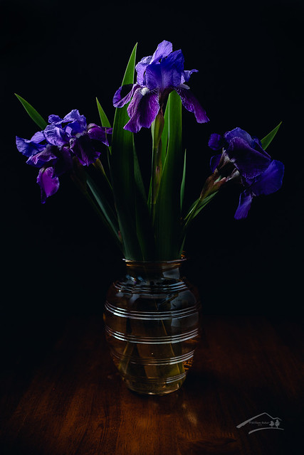
A few lonely Irises have appeared, and I didn't have anything to do, so a quick set up in studio for "Royal Purple". In keeping with the Color Harmony theme of the thread I chose a Triad Scheme (3 hues equally spaced around the color wheel). In this case Purple was the primary or dominant hue, with Green and Orange hues filling the other two spots. I didn't feel like setting up everything for a white line shot of the glass vase, so I tried something a little different. I went with a large Softbox high left and behind the arrangement feathering the tops of the flowers, pointed to just right of the camera. On camera right was a white reflector to bounce light back into the shadows, and a flag camera left blocked the light from flaring.
Royal Purple by William Raber, on Flickr

William, superb image and really nice explanation of your color harmony thought processes. Green foliage is an interesting color. Dan Margulis in his Photoshop LAB Color book says that natural vegetation is some green in the A channel and about 1.5 to 2 time more of yellow in the B channel. So green foliage can have warm or cool characteristics depending upon the mix. And having bits of more yellow coming up those green fronds nicely balances the lower warmth from your orange.
Purple is a mix of magenta from the A channel and blue from the B channel, and again depending upon the proportions can be cool or maybe not as cool.
Orange is always warm, having mixes of magenta from the A and yellow from the B channels.
And I really like how your lighting causes your subject to be emerging from background.
 
At the moment we've 3 different types of orchid that are in bloom, I'm not a "flower photographer" but I didn't want to skip this one.
It's a quickie from this morning before we had our coffee. Diffuse daylight through the kitchen window and just a white A4 to illuminate some shade. For the background I've taken a gray, cardboard, envelope and as a final action I've made a transparent green layer in post to make the background darker and more harmonious with the subject.
Fuji XE1 + 18/55mm - tripod

View attachment 170671
gk, it's interesting that your color harmony is similar to William's triad of purple, green and orangey yellow! Great idea to colorize your background.
 
It is amazing the different colors that appear when the sun starts to rise. I got up before dawn on Sunday and was able to capture this photo. View attachment 170669
Sunrises and sunsets often seem to act as a natural color harmony selection don't they?
Yours here Scott is a darn fine illustration of complementary harmony I think, with orangey reds contrasting against greenish blues. The longer light wavelengths coming through more atmosphere near the horizon are naturally selected while higher up in the sky the shorter wavelengths are allowed to come through and be seen. Pretty cool.
 
@gk fotografie I love Orchids. Couple years ago we were at the Naples, FL Botanical Gardens. They had an area the size of a house devoted to nothing but Orchids, more varieties then I'd ever seen. Must have spent a couple hrs just in that section shooting.

@johngpt this wasn't my first choice for lighting but I was to lazy to pull everything out, so I improvised. I liked the effect of the overhead/rear light but reflections were a PITA.
 
It is amazing the different colors that appear when the sun starts to rise. I got up before dawn on Sunday and was able to capture this photo. View attachment 170669
Sunrises and sunsets often seem to act as a natural color harmony selection don't they?
Yours here Scott is a darn fine illustration of complementary harmony I think, with orangey reds contrasting against greenish blues. The longer light wavelengths coming through more atmosphere near the horizon are naturally selected while higher up in the sky the shorter wavelengths are allowed to come through and be seen. Pretty cool.

Thanks
 
All this color harmony reading got me thinking about gradient mapping.
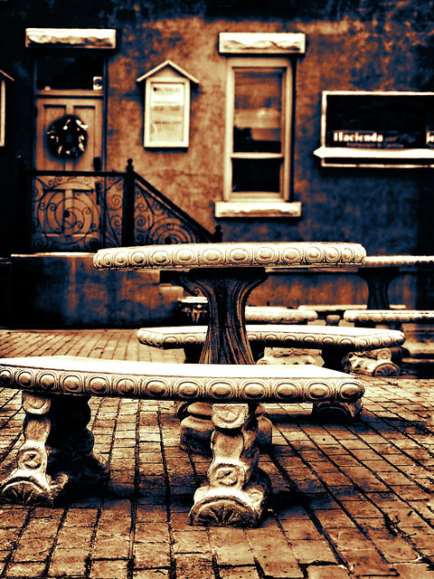
So I used an image that I'd edited from color to black and white. It was today's post at Flickr for Bench Monday.
It's a heavy handed edit done on the phone with Snapseed and Hipstamatic, originally in color. Then it was later converted to b/w using primarily the green channel in Ps.
I then explored using a gradient map adjustment layer in Ps as seen in the image below the b/w.


benches and table


32521912347_97fc1b3c87_z.jpg


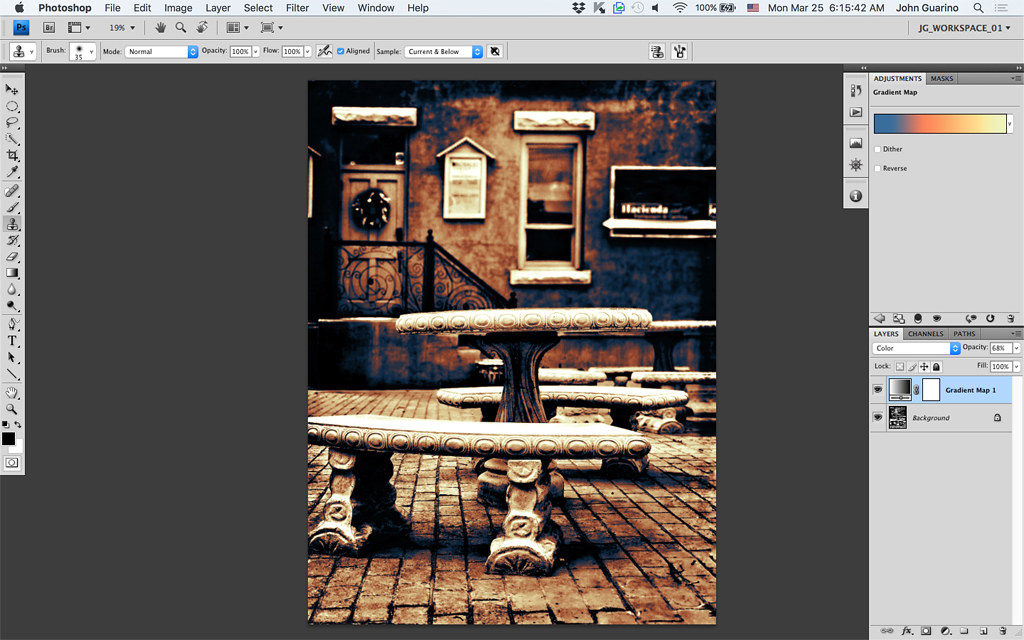
Below is a screenshot showing the gradient map adjustment layer set to Color blend mode. Above the Layers panel you can see the four colors I had chosen for the mapping. I chose three from the warm side of the color wheel, each with slightly reduced brightness to map from luminosity zones 10 down to about 4 or 3. Then I chose something complementary to the warm yellows, a blue to map into zones 3 to 0.

46740628744_1988203871_b.jpg


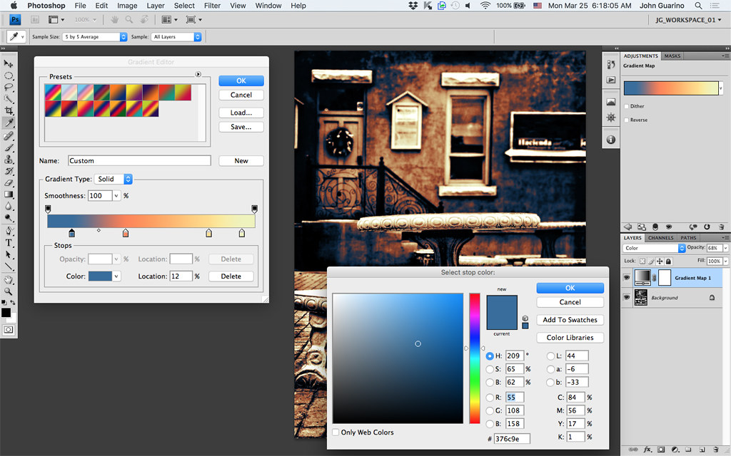
Since I'd never done this before it took me a bit to figure out that I had to click on that colored bar up by Adjustments Gradient Map to open the gradient dialog. Then I figured out that if I clicked on those pointy blocks below the colors in the gradient map dialog that opened, I could choose a color. The screenshot below shows me choosing the cool blue for the darker zones.

32521990027_99dde14ced_b.jpg


Thank you Sharon for this challenge and providing the links that were so informative.
I've been learning a lot.

.
 
Last edited:
Since I'd never done this before it took me a bit to figure out that I had to click on that colored bar up by Adjustments Gradient Map to open the gradient dialog

I've been using a similar technique with gradient mapping and a curves layer to color grade portraits. If I see a specific look/tone, in an image I can duplicate that as a file that can be replicated in my image. I've created a database of several of these that I use from time to time. Makes creating a consistent yet easily changed look.
 
A part of the dishes from last night,

A few lonely Irises have appeared, and I didn't have anything to do, so a quick set up in studio for "Royal Purple".

I enjoyed both of these. Simple but eye catching. Just goes to show there are interesting images all around...we just have to capture them.
 

Most reactions

Back
Top