What's new

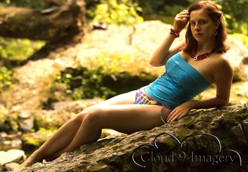
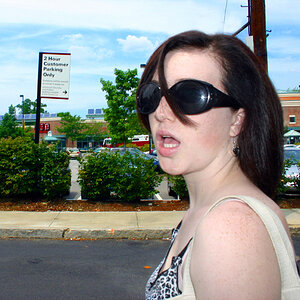
What's your opinion regarding the shading on the top of her body vs. the bottom?

cloud9imagery

TPF Noob!
Joined
Jul 6, 2011
Messages
66
Reaction score
7
Location
Manchester, Tennessee
Can others edit my Photos
Photos OK to edit
$WM_IMG_9966.webp

Thanks in advance!
 
Its natural light ?

If you dont like it, you need to put a reflector in front of her or use a fill flash.

Any reason why you used ISO 1000 for a perfectly static scene ? The noise is overwhelming ...
 
Fill flash on her face would have softened the shadows there. The Blown Out highlights on her legs... terrible. The light always needs to be balanced over the whole body... you can't have part of her in the sun.. and part of her in the shade... it just does not work (unless you really know what you are doing).

If you had used large diffuser to throw some shade on her legs.. it probably would have been ok. Or had all of her in the shade, as mentioned. The blown out background elements are not good either... the eye is drawn to the brightest part of the photo... which is not your subject.

It is also Very Noisy.. as was pointed out above. You shot this at ISO 1000, and 1/500 of a second. You could have lowered your shutter speed to 1/100 (Focal length was 88mm) and lowered your ISO to 400... and greatly reduced the noise. I assume you understand the exposure triangle, and how those setting relate to each other?

I am surprised it is that noisy.. I thought the 7D would do better than that. Did you add noise in post?
 
A basic tenet of the visual arts is "light advances, dark receeds". In other words the human eye is drawn to the brightest parts of a photographed scene, a painting, etc.

In this photograph the brighest part of the scene is the background, and not the intended main subject.

Stated another way, the photo demonstartes very ineffective use of light. Regardless the light source, the fundamentals of photographic lighting have been identified by trial and error in the 200 or so years people have been doing photography. What works and doesn't work relative to the use of light in the visual arts has been identified in 2000 years or so of trial and error.

A common cause of this type of lighting in a photo is using an inappropriate metering mode.

Light Science and Magic, Fourth Edition: An Introduction to Photographic Lighting
 
Last edited:
A basic tenet of the visual arts is "light advances, dark receeds". In other words the human eye is drawn to the brightest parts of a photographed scene, a painting, etc.

In this photograph the brighest part of the scene is the background, and not the intended main subject.

Stated another way, the photo demonstartes very ineffective use of light.

Dude....that's my old history of art professor's CONSTANT refrain: "Light advances, dark recedes." Ack! Yes, the lighting here is...not the best...but even so, I think the image could be improved somewhat, but the highlights on here leg indicate to me that the original exposure was "over" quite a bit...looks like there is some irreparably lost detail in the highlights. The issue isn;t so much the shading on her body as it is the bright background...that awful "yellow highlights" look is the bane of digital photography...my suggestion is to change this to a B&W shot...it looks poor in color, to me. In B&W, I think it would look better, and would allow you to perform the heroic Photoshop rescue this kind of shot will need. And it's a shame...a 42 x 72 inch white reflector board could have turned this shot into a straight-outta-camera (SOC) JPEG winner...

Ah well, there is always next time! Lesson learned.
 
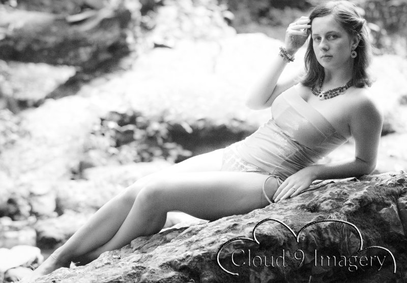
Okay, well...here's my follow-up. Well, since "light advances and dark recedes," what I did was to remove the color by desaturating the image, and then drastically lighten up her face AND all of the darker values.When an image has been badly overexposed and you want to convert it to B&W, sometimes simply desaturating an RGB color image works better when a "rescue" type of manipulation is needed, so I stayed in "RGB" mode, and then applied Recovery, and Clarity Minus, desaturated the image a bit, then set a black point, and in general tinkered around with the image to sort of create more of a higher-key image...to basically shift the "key" of the image upward a bit, to give it a more airy, summery feeling....lighter, and more,well, "ethereal". By lightening up her face, and all the OTHER DARK areas, what happens is a lowering of the light advances dark recedes effect. So, this is a quick fix. I think it makes a much better picture....kind of an old-time retro glamour look.

145105771.jpg
 
Nice edit. I much prefer the B&W rendition.
 
Thanks cgipson, thanks SoonerBJJ. I never magnified the image when I was editing it, and was surprised to see what it looked like at FULL resolution...a wonderful almost reticulated B&W film-like look that used to be soooooooo doggone hard to get and almost impossible to predict or repeat. WM_IMG_9966-1.jpg photo - Derrel photos at pbase.com

That look is close enough to reticulation for artistic purposes...I don't find it that objectionable. I think it would look decent printed.
 
nice touching Derrel. Ur observation on the pic is really accurate.
 
Nice Derrel, Nice retro look. Could have been taken in the 50's. I like it.
 
Thanks everyone. I am still learning photoshop, so I appreciate the help. Also, I did reduce the resolution of the photo before posting it, so I'm sure that had something to do with the noise? It is perfectly clear in the original. And, yes, love the b/w.
 
That b&w edit is beautiful!
 

Create an account or login to comment

You must be a member in order to leave a comment

Create account

Create an account on our community. It's easy!

Log in

Already have an account? Log in here.

Back
Top Bottom