What's new

Which looks more sensuous?

Frequency

Been spending a lot of time on here!
Joined
Oct 17, 2010
Messages
8,864
Reaction score
683
Location
Calicut, Kerala,India
Can others edit my Photos
Photos OK to edit
These were taken from my Home garden....Which one you think more sensuous?

#1
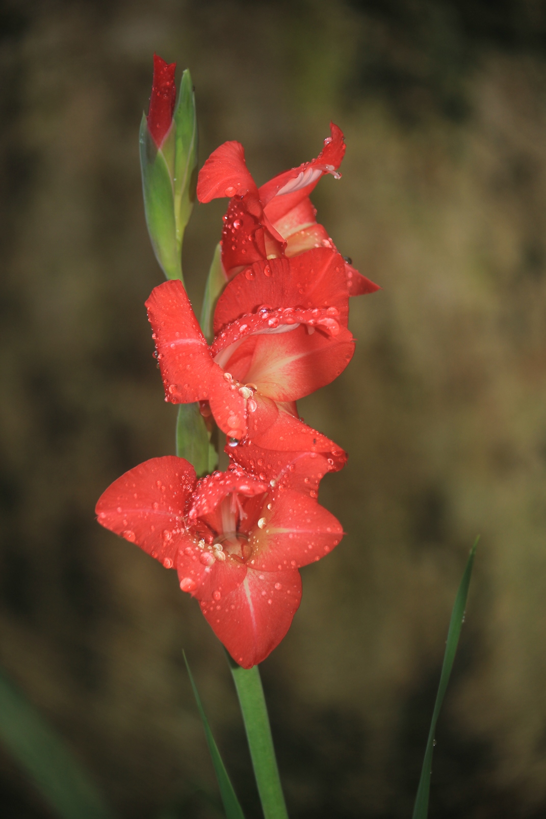


#2
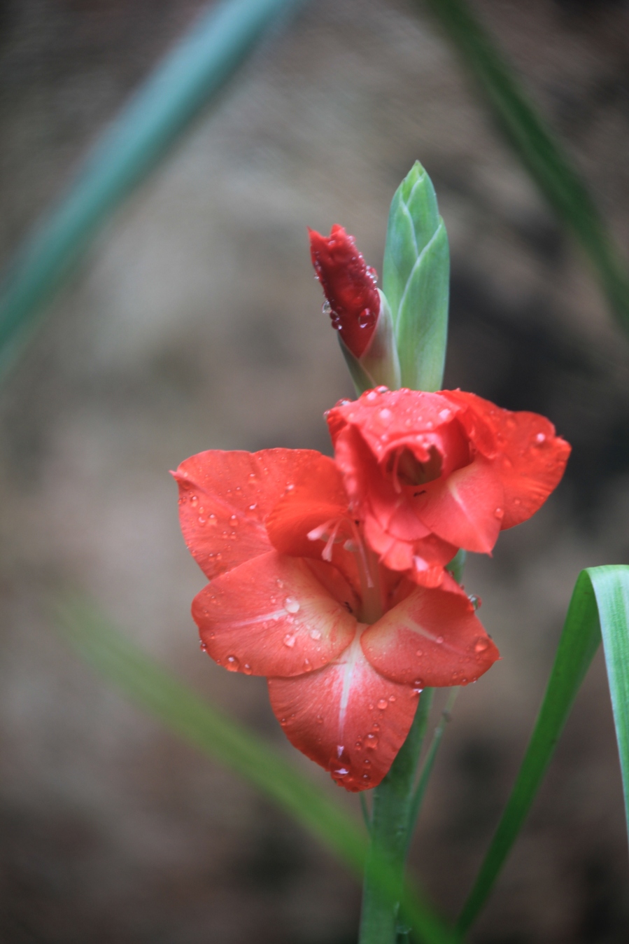


#3
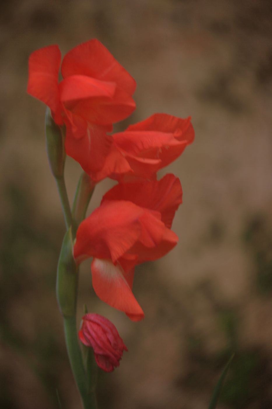


#4
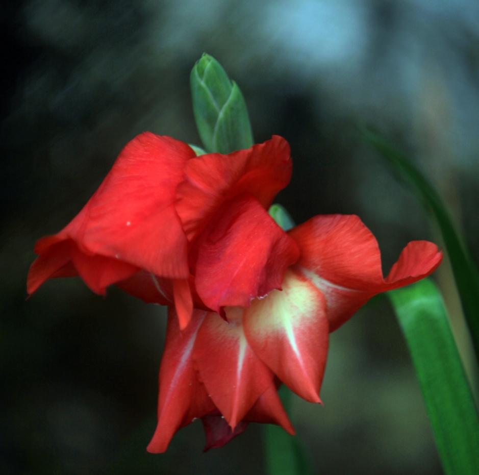


#5
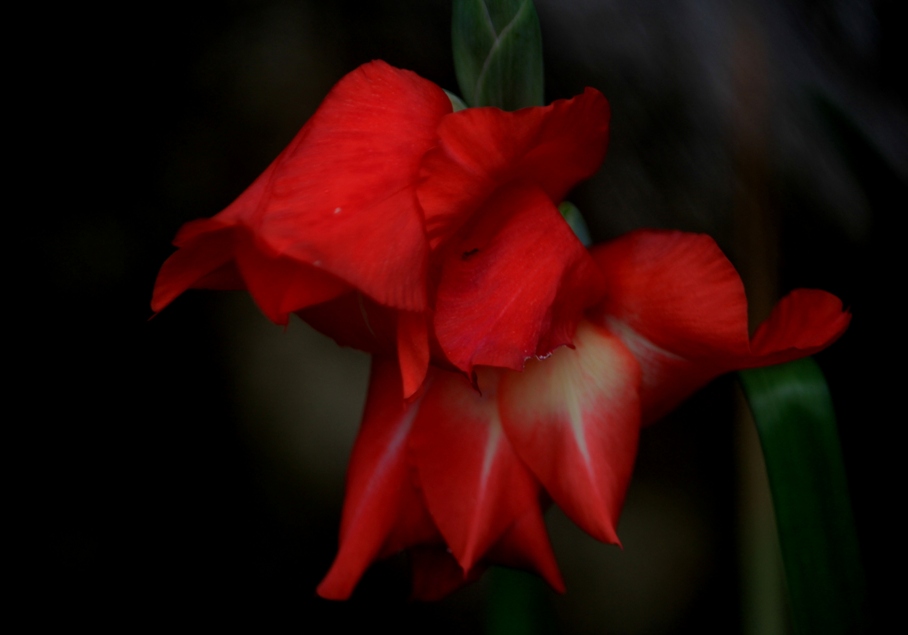


Thank you for your viewing and comments

Regards
:D
 
I don't know...3 or 4??
 
I prefer #1 and #2... very nice!

#3 and #5 appear to be slightly underexposed..

#4 is nice.. but doesn't "get" me!
 
tossup between #1 and #5
 
IT is NOT #1....I would say #3 or #4.
 
#1 looks best to me; good contrast, crisp highlights and you almost eliminated all distractions. #2 has too many distractions included, that also those in the background. #3 is too muffled, it is not luminous, the details of the flower escaped. #4 is perfect, but you include competing highlight which steals a bit of attention. #5 is like #3, has good composition but some radiance escaped.
 
thank you Timor; those were your studied evaluations indeed; thank you very much
Regards :D
 
I'd say 5, but lighten it a bit. Otherwise you could use 4 if you made it a little darker and and also darkened that light blue spot at the top a bit.
 
Yes, my feeling is also #5....
Actually i did not notice the blue there in #4 even though it is very conspicuous there !!!!

Regards KenC :D
 

Create an account or login to comment

You must be a member in order to leave a comment

Create account

Create an account on our community. It's easy!

Log in

Already have an account? Log in here.

Back
Top Bottom