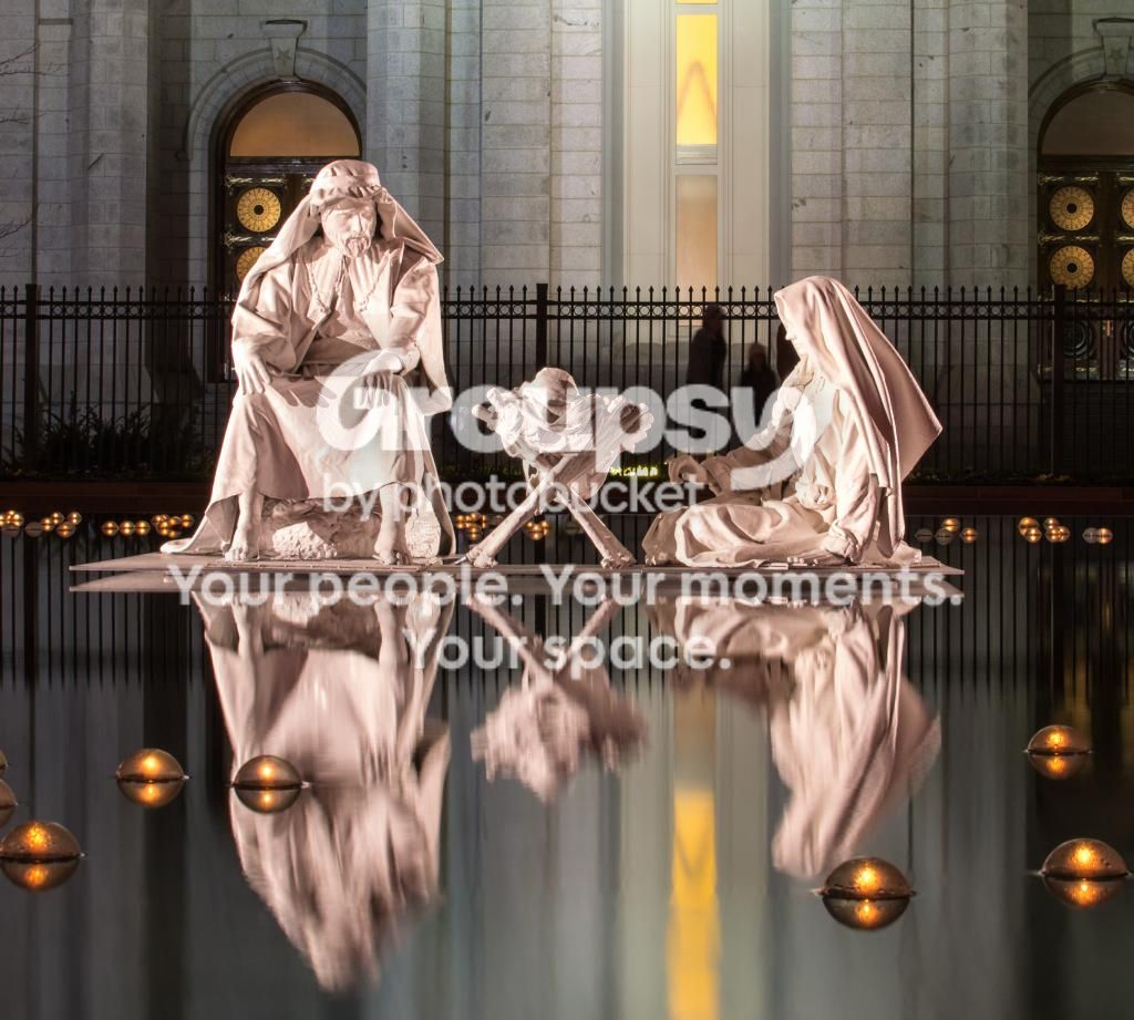
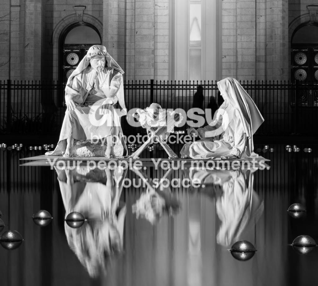
I was leaning towards color too - this is the nativity scene at Temple Square in Salt Lake City...just wish it wasn't mobbed with people at the time I was there.
I'm the opposite on this one... the b&w... I would have liked thecolor better, except the color of the door over the statue top left detracts from the statue... in b&w that distraction is removed and you suddenly have a balanced composition.
maybe cropping out he right arch (and some of the left) to a square format... and desaturating the left one to match the saturation of the building facade would have me preferring the color over the b&w.





![[No title]](/data/xfmg/thumbnail/36/36134-64e77d33cc4c68e1253adc2879f24a96.jpg?1734168240)
![[No title]](/data/xfmg/thumbnail/42/42458-8274869c9294d2f0655f80c8f0e6048c.jpg?1734176996)
![[No title]](/data/xfmg/thumbnail/35/35956-7047189d31e1c1f6029266079390f54a.jpg?1734167778)
![[No title]](/data/xfmg/thumbnail/32/32631-60d0db057ee085953a0921e337396654.jpg?1734162116)