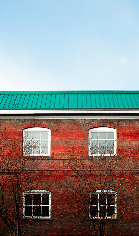
I think it works as a presentation of color and also for having a little mystery. I agree with the comment about too much blue. One could see it as a contrast in color and texture, but it just isn't that interesting and I think a slice of it a little bigger than the roof would still accomplish these things.




![[No title]](/data/xfmg/thumbnail/34/34114-dd12be026979ccd4182c5f478bd91448.jpg?1734164566)

![[No title]](/data/xfmg/thumbnail/39/39180-3dcdd0aa38e4d015a48a17b0e45542fb.jpg?1734173054)