My first thought is that there is way too much going on in each of these, there's no clear subject to me. In particular the first three seem like snapshots of places you wanted to remember from a visit to Chicago. The fourth is a more detailed case study, but I think there's still too much included (more on that below).
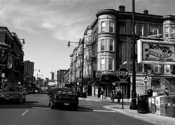
Broadway & Melrose:
I like the tonal range in this. There seems to be a slight clockwise tilt which bugs me. There's a lot going on, but what keeps drawing my eye is the column of round rooms on the corner of the building (due to it's relative size in the frame, position of close to center, and relative brightness); since this is the most dominant feature to me, I'd like to see it vertical (the vertical sides of those windows appear to be off vertical a bit). I realize that with perspective and street slope there aren't many truly orthogonal lines, but it would feel more correct to me if these windows were vertical.
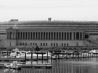
Soldier Field:
There are three things that distract from the subject of this shot being Soldier Field. One, the stadium itself is largely the same shade of middle gray and thus appears relatively featureless. Two, the gray of the stadium can't draw the eye like the brighter sky above it or the brighter boats below it. And three, the bottom portion of the image with its water and piers and bright boats and dark piling has more interesting things going on.
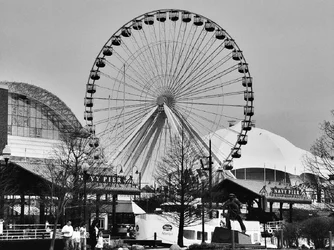
Navy Pier:
I like the angle from which you shot the ferris wheel. It's unfortunate that the buildings are so tight to it on either side. It's not your fault, and even if you could have picked a different angle to get more spacing between the buildings and the ferris wheel your perspective of the ride would have suffered. Decent tonal range - it's a bit darker than I'd like, particularly the sky, but I don't know that you could have gone lighter without that white roof becoming too distracting. Perhaps some selective dodge/burn would help.
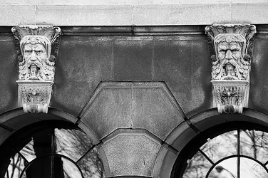
Key Stones:
You've captured some great textures in this shot! I think it's very interesting how the two sculptures, which were probably pretty darn identical originally, appear so different here. I personally think this scene would work better as multiple tighter captures rather than trying to get this all into one frame. The two sculptures would probably work well as a diptych, with each frame tight on just one sculpture, there's just so much detail to capture there. And I could see a nice capture, a pseudo abstract, of the texture and geometry of the wall with or without any of the window as a counterpoint. But in this shot the sculptures are far enough apart that they are relatively small in the frame, the reflections in the windows are a bit distracting, and so is the light portion of the wall across the top (you can't crop that out without losing the tops of the sculptures, but perhaps you could burn it to bring it closer to the tone of the rest of the wall).





![[No title]](/data/xfmg/thumbnail/31/31096-b9b8d52b45753cd4f9251832149ef9da.jpg?1734159254)

![[No title]](/data/xfmg/thumbnail/34/34593-f9e16dc135ec1fcde87624f30e703802.jpg?1734165595)