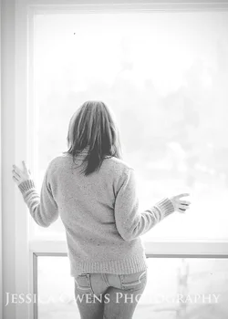
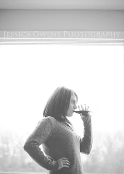
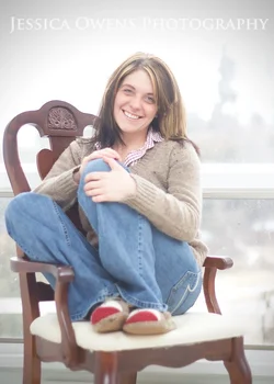
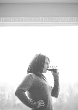
Jess, I like the ideas behind these... But shooting them wide open isn't doing them any favors. With number 3 in particular, the softness at the bottom of the frame is very distracting to me. Not sure why, but the OOF areas just look odd. They just don't appear to be rendered properly and are overly fuzzy, but not creamy (if that makes sense). With the distance between her and the background, f/2.5 - 2.8 probably would have worked better IMO. #2 is probably my favorite, and I dig the processing. But the framing element at the top is slightly tilted. I think if you straightened that out and tried to see if you could do anything about increasing contrast on the stem of the glass, it would be a real winner. :thumbup:









![[No title]](/data/xfmg/thumbnail/37/37604-7ad625e983f92f880eb65a264eeef5e4.jpg?1734170732)


![[No title]](/data/xfmg/thumbnail/37/37603-739c5d9b541a083a12f2f30e45ca2b7b.jpg?1734170731)