Wisconsin's North Woods Shoot

jrice12

TPF Noob!
Joined
Aug 9, 2011
Messages
193
Reaction score
5
Location
Madison, Wi
Can others edit my Photos
Photos OK to edit
Back from three days groping through the north woods shooting anything that doesn't move.

First day's work - these are probably considered close-ups rather than "Macro", but the subjects are really quite small.


First shot: Maple seed. Framed to look like it fell from far above. Too bad it was damaged. Light was great on this one - it's hard to get that just right out in the field...

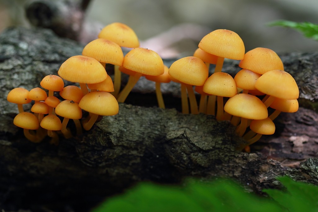
Second shot: My favorite. I like the color and composition - lighting was a little flat through. Was tempted to PS some of the black dirt spots off the shrooms, but decided to leave well enough allone. Would any of you have gotten rid of some of that dirt or would that make the shrooms look to sterile? Too me it looks like Flickr reduces brightness slightly(?) - does Flickr put up the original or do they transcode or something?

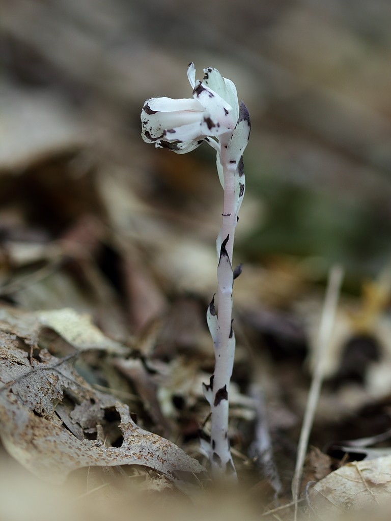
Third shot: Another of the ghost plant. Better background on this one I think. Somehow it looks like a dog at attention. Lighting is a bit flat again.

Forth shot: Brown Mushroom. Manual focus stacking of six images (only on the shroom). Still not convinced that this looks realistic or adds that much to the image. Doesn't look "cut and paste" but doesn't look quite right either. Umm, I will need to bring my dust blower to clean these subjects up a bit...


6094609588_7f647ea15a_b.jpg


6094609380_4c66cf20cc_b.jpg


6094609166_3d551a0227_b.jpg


6094070299_ec86f36c66_b.jpg
 
I actually think the damage to the seed makes that shot, it gives it a story (a tale of its journey). In the second shot I agree the dirt should stay, makes it feel more visceral to me. As far as composition goes I would have moved the ferns in the foreground of the shot (IMO). The third shot is my favorite, I would crop the unfocused bit at the bottom of the shot though, it's a bit distracting, but again that's my opinion. Nice shots, looking forward to more!
 
You are probably right about the damage. It originally caught my eye because the seed (bearer of life) was sitting on a dead and decaying tree stump - I liked the lack of life-colors execpt for the seed itself - one gets the feeling that life will go on!

Actually, I placed the fern there! Felt I needed that dark green to balance the orange and help bracket the shrooms. It was pretty dark and bleak down there, but maybe I shouldn't try to improve on Mother nature!

Third, I had already cropped a lot away but felt I wanted a bit left for depth. It's color matches the rest of the foreground so thought it not too distracting. Plus I didn't want to lose the curvature of the dead leaf at left-bottom. Also, I wanted the flower to have a "root" or base to come out of and wanted a "tall" image to match the flowers lack of branches and leaves. The thing that distracted me was the white, out-of-focus, stick on the lower right - nearly parallels the subject and begins to steal the show! Hard to figure out just what to do with an image as far as cropping, I've never actually been any good at it.

Thanks for the comments.
 
After just testing my theory (by putting my finger over it) I agree with you again, seeing where it's coming through the leaves is an important facet of the shot which makes the bottom of the photo more valuable than I originally credited. As for what you could do with a crop, you could crop in tight on the subject on either side leaving out the stick and some of the unfocused portion to the left while leaving the important bit untouched. Now that I've looked at for a while it's what I would do, but it is your photo, and in the end what you think is what counts :).
 
Last edited:
I actually think the damage to the seed makes that shot, it gives it a story (a tale of its journey). In the second shot I agree the dirt should stay, makes it feel more visceral to me. As far as composition goes I would have moved the ferns in the foreground of the shot (IMO). The third shot is my favorite, I would crop the unfocused bit at the bottom of the shot though, it's a bit distracting, but again that's my opinion. Nice shots, looking forward to more!

Have to agree with this.

The first does have a lot of empty space, and when it's in an oof area it won't necessarily add a lot to the image (not saying that as a rule or anything, just a consideration).

I'd like to see the mushrooms in the second filling the frame without the ferns; I think that could make a nice shot. The other thing to consider in PP is to reduce the saturation in your greens, which would reduce the eyes attraction to the ferns, and make the mushrooms orange stand out more.

The oof section at the bottom of three catches my attention first; otherwise I like it because it's a little intriguing. If you try to crop the image you have you will loose the base of the subject though, which I would find equally annoying.

The fourth doesn't do a lot for me, not sure what to comment for it.
 
For #1, I felt the space at the top was needed to convey the great height from which the seed came. This thing "came from the heavens". The out of focus tree in the background hints at where the seed came from, and this directing of the eye, I felt, needs space (though the tree trunk doesn't actually work well for this). The spotlighting effect on the wings also imply "something from above". When I place may hand over the top quarter to reduce that space the meaning of the image changes for me - it just becomes a study of a seed. I say it is unfortunate about the damage to the seed (not the wings) because it moves that part toward the camera and out of focus relative to the other half in a way that breaks the symmetry (much more so than the damaged left wing). Things from the heavens shouldn't have broken symmetry ;).

I agree about the fern, something is needed at the bottom but the fern may be too busy for the job it is supposed to do.

The fourth is just an experiment with focus stacking. I am becoming less enchanted with it the more I use it. I think focus stacking may only work for bugs ;)
 
Ok, went back through the photo set and found one with the orange mushrooms with less fern (before I moved the fern into position). I just didn't like the bulbous, dark wood below the shrooms and its coloring etc. Maybe this one is better though:

6098125990_092d665a07_b.jpg
 
Love that shot, you still have the contrasting colors without taking away from the subject (shrooms). It's as if they grew to be photographed.
 

Most reactions

Back
Top