Working on some new PP techniques and need serious critiquing

ceeboy14

TPF Noob!
Joined
Dec 5, 2012
Messages
2,566
Reaction score
788
Location
Florida
Can others edit my Photos
Photos OK to edit
This is more about the process than the composition, aesthetics, etc. I am attempting to learn processing through the use of luminosity masks, channel masks, blurring techniques and a variety of other blending modalities...it's all enough to make you want to cry sometimes, but it is also quite rewarding to see places you can take images that conventional curves and levels adjustment wont quite allow. I figure my learning curve to be at least a year....and then likely for the rest of my days because every time you figure out a way to make something better, you discover three other possibilities.

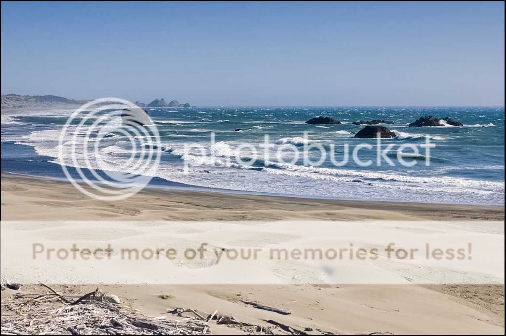
Simple Beach Vista taken somewhere along the southern Oregon coast. I did use a .6 Lee GND to hold back an overly bright afternoon sky though there was a good hint of an incoming fog bank to the south.

Raw File

$9463989835_86e763f15c_o.jpg

Processed File (cropped)

$9466771350_22f9684941_o.jpg
 
Ok...couldn't figure this out at first...good move, whomever.
 
I use only software ND grads so I would've saved the trouble there. I don't get the formatting change in the second image, and I don't see the need for elaborate masks and blending techniques. It's an option, but this image doesn't merit serious editing. I would've done an existing color profile and white point and black point sliders in LR, maybe some Nik filters.
 
Processed File (cropped)

View attachment 52110

I think you're making it a lot harder than it needs to be.

Since you don't include any details of what edits you did, I did an edit of the original and will detail what I did.

First I opened the photo in Camera Raw to make global adjustments.
I adjusted the White Balance by clicking the White Balance eyedropper tool on the largest portion of white water there near the center of the image.
That set the Temperature to +10 and the Tint to +12, effectively warming up the image some.
Then on the Basic panel I added 0.5 EV of Exposure, +28 of Clarity, +28 of Vibrance, and +30 of Saturation.
Using the Sharpening panel I added some capture sharpening 25, 10, 25, 0 and Noise Reduction - Luminosity 0, Color 77, Color Detail 50.
At this point this is what the image looks like:
946CR3989835_86e763f15c_o-1.jpg


Next was local adjustments in CS 5.
On the Background layer I used the Quick Selection tool to select the water and the rocks in the water (no beach, no sky).
I saved that selection (Select > Save Selection) and with the selection active I clicked on the Create a New Adjustment Layer icon and made a Hue/Saturation Adjustment layer. I only adjusted the Saturation of the water/rocks to +20 in the Hue/Saturation window.
I duplicated the Background layer (make the Background layer the active layer and use the CTRL-J keyboard shortcut, or drag the Background layer down to the Create a New Layer icon.), retrieved the previously made selection, added to the selection so it included the land and hills in the background and made a mid-tone contrast adjustment to the selection. There are several ways to do mid-tone contrast adjustments. To save time I used Topaz Adjust's Clarity preset and under the Ps Edit tab Faded the adjustment to 50%.
I duplicated the edited image (Image > Duplicate) so I could do a crop and added a narrow black border using the Image > Canvas function to both the un-cropped and cropped versions.

946Ps3989835_86e763f15c_ocopy.jpg


946PsCrop3989835_86e763f15c_ocopy2.jpg
 
The colors in the second one are much more appealing (although bordering on overdone), and you've done something that increased acutance massively, to the benefit of the picture. The waves positively crackle in the edit, which they should. The break is a chaotic system so it's one of those rare things that can stand pretty much all the acutance you can cram in there.

I don't understand any of the technologies you're applying here, so I can't help there.
 
:thumbup: Really nice job with the edit -- your end result is a bullseye.

Thoughts: Looking at the raw conversion I assume that's where you moved on to Photoshop. I would have tried to take the raw conversion a little further. My goal is to go as far as I can with the raw conversion. What I'm working on right now is making better use of the local adjustment functionality that's becoming standard in raw converters -- ACR/LR's adjustment brush, layers in C1, etc. They're comparatively crude still up against Photoshop's layers but they do allow us to accomplish more before the RGB conversion.

Entirely agree that once the raw file is moved to Photoshop, apart from cloning type stuff the serious value in Photoshop is it's ability to make local adjustments with precise layer masks and blending. Not wanting to send you off on a tangent but considering the power in Photoshop's blending modes wouldn't it be nice to have access to those in the raw converter? If that tweaks your interest have a look at LightZone (now available as open source).

Joe
 
I use only software ND grads so I would've saved the trouble there. I don't get the formatting change in the second image, and I don't see the need for elaborate masks and blending techniques. It's an option, but this image doesn't merit serious editing. I would've done an existing color profile and white point and black point sliders in LR, maybe some Nik filters.

I hope you meant to say doesn't require serious editing.

The OP said he was working on processing methods and given the description of what he's working with, layer masks and blends as compared with Curves and Levels (or white and black points in LR), this image was an excellent choice because of the highlights in the breaking waves.

Joe
 
I do like the crop, but the processing seems over the top to me. That is pretty much a matter of taste - I like landscapes to look more natural, which would be somewhere between the two images. I've seen many landscapes that were a bit much for me, but which many people like, and this one seems similar to those. It certainly fits the criteria Andrew was discussing in another thread about color theory and probably would sell to someone who had blue as their main palette for a room.
 
:thumbup: Really nice job with the edit -- your end result is a bullseye.

Thoughts: Looking at the raw conversion I assume that's where you moved on to Photoshop. I would have tried to take the raw conversion a little further. My goal is to go as far as I can with the raw conversion. What I'm working on right now is making better use of the local adjustment functionality that's becoming standard in raw converters -- ACR/LR's adjustment brush, layers in C1, etc. They're comparatively crude still up against Photoshop's layers but they do allow us to accomplish more before the RGB conversion.

Entirely agree that once the raw file is moved to Photoshop, apart from cloning type stuff the serious value in Photoshop is it's ability to make local adjustments with precise layer masks and blending. Not wanting to send you off on a tangent but considering the power in Photoshop's blending modes wouldn't it be nice to have access to those in the raw converter? If that tweaks your interest have a look at LightZone (now available as open source).

Joe

I used to do a lot more in the RAW editor than I do now because almost everything I can do in there, I can do using the other methods and better because I can target specific areas of light and dark, contrast ad HSB. At the most, I might adjust the color balance, tweak the blacks, contrast and highlights and in some instances, the shadow adjustment. I do calibrate for lens and color aberration then send it directly to Photoshop.
 
Processed File (cropped)

View attachment 52110

I think you're making it a lot harder than it needs to be.

Since you don't include any details of what edits you did, I did an edit of the original and will detail what I did.

First I opened the photo in Camera Raw to make global adjustments.
I adjusted the White Balance by clicking the White Balance eyedropper tool on the largest portion of white water there near the center of the image.
That set the Temperature to +10 and the Tint to +12, effectively warming up the image some.
Then on the Basic panel I added 0.5 EV of Exposure, +28 of Clarity, +28 of Vibrance, and +30 of Saturation.
Using the Sharpening panel I added some capture sharpening 25, 10, 25, 0 and Noise Reduction - Luminosity 0, Color 77, Color Detail 50.
At this point this is what the image looks like:
946CR3989835_86e763f15c_o-1.jpg


Next was local adjustments in CS 5.
On the Background layer I used the Quick Selection tool to select the water and the rocks in the water (no beach, no sky).
I saved that selection (Select > Save Selection) and with the selection active I clicked on the Create a New Adjustment Layer icon and made a Hue/Saturation Adjustment layer. I only adjusted the Saturation of the water/rocks to +20 in the Hue/Saturation window.
I duplicated the Background layer (make the Background layer the active layer and use the CTRL-J keyboard shortcut, or drag the Background layer down to the Create a New Layer icon.), retrieved the previously made selection, added to the selection so it included the land and hills in the background and made a mid-tone contrast adjustment to the selection. There are several ways to do mid-tone contrast adjustments. To save time I used Topaz Adjust's Clarity preset and under the Ps Edit tab Faded the adjustment to 50%.
I duplicated the edited image (Image > Duplicate) so I could do a crop and added a narrow black border using the Image > Canvas function to both the un-cropped and cropped versions.

946Ps3989835_86e763f15c_ocopy.jpg


946PsCrop3989835_86e763f15c_ocopy2.jpg

Thanks, Keith. I did essentially the same thing only I used preset luminosity maskings I have in a program. These keep me from having to build and rebuild selections for each image. In looking at your final edit and mine (and they are pretty close), I think I used a blacks mask with I should have used a lights mask. I should have gone more for the lighten and decrease contrast. I may even have to use a darks mask and subtract a lights mask from it to get the water range where it isn't so saturated. Fortunately, I have the file saved as a psd and can go back and dump that layer and replace accordingly.
 
I do like the crop, but the processing seems over the top to me. That is pretty much a matter of taste - I like landscapes to look more natural, which would be somewhere between the two images. I've seen many landscapes that were a bit much for me, but which many people like, and this one seems similar to those. It certainly fits the criteria Andrew was discussing in another thread about color theory and probably would sell to someone who had blue as their main palette for a room.

Thanks, Ken. It is a little over the top but I can't tell how much without some initial feedback as no one in my immediate realm has a clue what I am doing. I think you'll see a huge difference between this one and the ensuing edit.
 
I've never much cared for the GND in the RAW editor...it's okay to a point but just one of those tools I generally avoid. I like your webpage...nice work.
 
New Edit. What are your thoughts?

$9466051693_baca9fdbae_o.jpg
 
Yeah, that works for me.
 

Most reactions

Back
Top