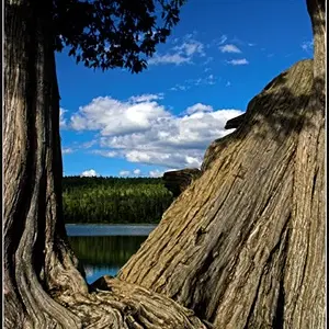
First off, I love the composition of #1. The framing that the trees provide is excellent. The slight tilt to the image COMPLETELY kills it, though. As mentioned before, a slight rotate will fix this problem. (You also appear to have a wee bit of barrel distortion as well, but that isn't a huge deal.)
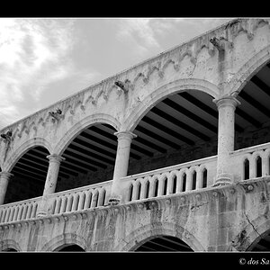
#2 is great! I love all the lines in it as the color of the sky reflecting in the windows.
#3 is awkward for me. As mentioned, the building seems to be growing out of her head. In portraits, the background should frame the person, not contact them. The lighting also isn't very preferable in this shot. Maybe the use of some fill flash would have helped brighten up her face, but right now, the light only gets on her shoulder and is leaving her face dark. Although I add vignetting to most of my portraits, I think you went a bit overboard with this one. If it were me, I'd tone down the vignetting quite a bit. Lastly, the crop on her body is a little weird. A general rule of thumb is to not crop a portrait at a body joint. With this one, you've cropped off her far elbow and her waist. If you were to crop the image a little tighter so all of her elbow is out of the image, I think the shot would be better.