would love some C&C-thanks!

mamatomaya

TPF Noob!
Joined
Jul 10, 2010
Messages
34
Reaction score
0
Location
Nashville
Website
snapshotsbybri.blogspot.com
Can others edit my Photos
Photos OK to edit
*updated...more pics at post#12-thanks!

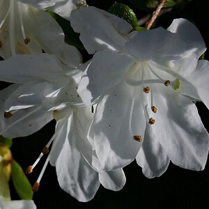
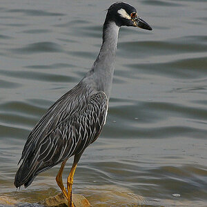
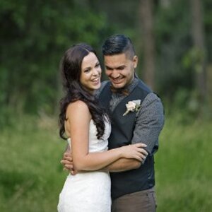
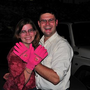
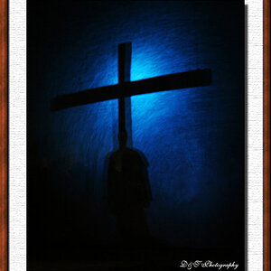
I would appreciate any thoughts you guys have on composition and PP of these. TIA!

1. 1/160, f5.6, ISO100 50mm
4831279487_55eb5d19c3.jpg


2. 1/200, f3.5, ISO100 50mm
4831279271_02d734754b.jpg


3. 1/250, f2.8, ISO100 50mm
4831889420_cbea36bc0f.jpg


4. 1/400, f2.8, ISO 50mm
4831279141_d489b5a2af.jpg
 
Last edited:
These are great portraits. #2 is my favourite. the background works well, her expression is somewhat unique and therfore shos a bit of character, nice catchlights in her eyes and good focus. If I was nitpicking I would say the hair could be tidier but it doesn't really bug me.
#3 I like the wooden background, although it may have been better if it was more in focus - as it is it is too out of focus too see any detail in it, but too in focus to be able to be ignored.

#4 is a great environmental portrait, nice job

#1 is my least favourite by far. the background is unappealing, plus her skin tone seems off. I also think this one should have been shot in portrait orientation.
 
The only thing I would add to the above post is try not to cut off the top of her head. I agree, #2 is a great shot. I love the expression and pose. Good job!
 
These are very good portraits, but I agree that they would be better if you had not cut off the top of the heads in two of them. I think number one and number three might look better in the portrait orientation instead of landscape. Number two and three are my favorites, especially number two. On the last one the hard shadows beneath the eyes and cheeks are distracting.
 
I echo the sentiments about the head being cut off, it was the first thing I noticed about the photos.

#1 is nice. I'd prefer a less tighter shot - pull back a bit.

#2 is adorable, love the focus on the eyes. Her expression is very nice, but her eyes lead off of the frame. Same problem with the head. The background fits well IMO.

#3 This is a little so-so, but I think holds the greatest promise of the four in a re-shoot. Obviously the girl is the star subject, but that wood is freakin' beautiful. Rich, dark with dark, weathered nail heads. I'd love to see more photos with that background in sharp detail, to convey the silky texture from the wood. Consider taking the picture at a side/profile position with the wood in focus near the girls face as she looks on/back at the camera.

#4 I can't quite pinpoint what it is but this doesn't quite go well with the rest of the series you posted. The colors seem a little muted to me.

Just my thoughts.
 
thanks everyone! this is very helpful! I will go back to my SOCC and see what I can go back and fix. The color in the pigtail pics were bothering me too. I really appreciate all of your feedback! i have 40 pics to go through and edit still so i may post some more :)
 
Obviously the girl is the star subject, but that wood is freakin' beautiful. Rich, dark with dark, weathered nail heads. I'd love to see more photos with that background in sharp detail, to convey the silky texture from the wood. Consider taking the picture at a side/profile position with the wood in focus near the girls face as she looks on/back at the camera.

Lol wood fetish :lmao:

I do agree though, it is some nice looking wood.

lol just sayin'
 
3rd one is definitely my favorite. Good work.
 
I like the 2nd one the best. The shadows, the colours, everything just pops and says "this is what photography is all about."

I don't particularly like the first one though. It's kind of tight and the white background doesn't really help the photograph. I think it kind of makes her face seem a little red. But that may just be me.
 
These are great portraits. #2 is my favourite. the background works well, her expression is somewhat unique and therfore shos a bit of character, nice catchlights in her eyes and good focus. If I was nitpicking I would say the hair could be tidier but it doesn't really bug me.
#3 I like the wooden background, although it may have been better if it was more in focus - as it is it is too out of focus too see any detail in it, but too in focus to be able to be ignored.

#4 is a great environmental portrait, nice job

#1 is my least favourite by far. the background is unappealing, plus her skin tone seems off. I also think this one should have been shot in portrait orientation.

++1.
 
Your color palette is nice on your best shots. On some of these though, your camera's Tone Curve setting appears too hot, and the girl's nose shows signs of blowout...the Tone Curve is just a bit too contrasty for the lighting on some of these. You've done a good job of orienting the camera horizontally on all of the shots that needed to be horizontally framed for maximum impact. In the first set, your last photo, of the girl standing with her hands on the railing is a good example of an environmental portrait that looks best as a horizontal; the first shot in the first set would have looked better as a vertical, and it has nice color.

You seem to have excellent rapport with your young subject in these two short sets.

Thanks! I am muddling through learning to use levels adjustments etc. I see what you mean about the blowout around her nose. Thanks again for your feedback!
 
Way to crank down that iso! Very good, sharp focus. Colors are spot on. Are these just RAW PP? or did you go into PS and edit them? I'm still trying to figure out if this type of PP can be done just by editing the RAW image data.
 

Most reactions

New Topics

Back
Top