New England Moments
TPF Noob!
- Joined
- May 13, 2007
- Messages
- 453
- Reaction score
- 0
- Location
- Vermont
- Can others edit my Photos
- Photos NOT OK to edit
Ok folks, heres a chance to sit behind the desk and review a few pics...
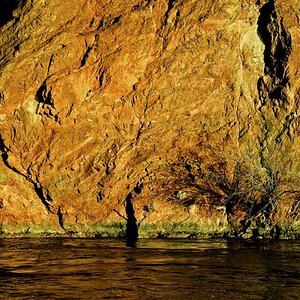
One of these (6) photos will appear in a "2008" Vermont Calendar, Theme, Covered Bridges.... You make the choice, which one is it??
WHATS YOUR PIC????
I usually submit around 50 shots, but will spare you here...
ONE
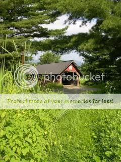
TWO

THREE
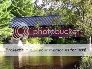
FOUR
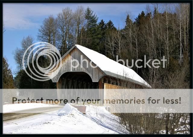
FIVE
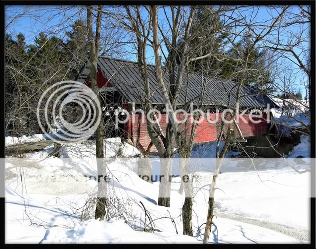
SIX

One of these (6) photos will appear in a "2008" Vermont Calendar, Theme, Covered Bridges.... You make the choice, which one is it??
WHATS YOUR PIC????
I usually submit around 50 shots, but will spare you here...
ONE
TWO
THREE
FOUR
FIVE
SIX

")

![[No title]](/data/xfmg/thumbnail/39/39292-4169a355b794ae9735845c4ad45d06ff.jpg?1619738958)

![[No title]](/data/xfmg/thumbnail/39/39295-230d6dc9ce62e92561457d4c8fb67dc6.jpg?1619738959)
![[No title]](/data/xfmg/thumbnail/37/37623-b930ccd802f79b9c9cea990a7a5e5462.jpg?1619738153)
![[No title]](/data/xfmg/thumbnail/36/36299-468f060314a0ac2bf5e37da1c33149d2.jpg?1619737493)