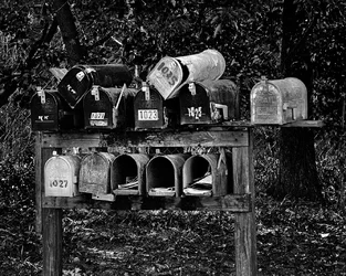
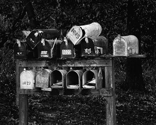
This is a cliche, but a great example of it! I love the crazy ones on top,
A trifle contrasty for my taste. The dark mailboxes are lost against the background a bit, and I'm not sure I love that. I might, though. The blending into the background, into the jungle, theme is sort of working for me.
The tree behind the rightmost mailbox is more problematic for me, I wish it were not so neatly cut in half by the mailbox. Perhaps a position a foot to the right? You want to maintain the other tree (the one 3/4 the way across the frame, almost on the left hand side) against the dark mailboxes, not the bright ones, I think.
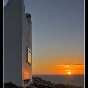
A little banal, a little cliched, but I kind of like it as a well done example of the form.






 Do settings need to be adjusted when using an adapted lens?




![[No title]](/data/xfmg/thumbnail/32/32929-22e23acc63d6ecb25e5ee941be87121f.jpg?1734162700)