Blacksmith: First time shooting people

RitchieE24

TPF Noob!
Joined
Jan 28, 2015
Messages
58
Reaction score
16
Location
Ontario Canada
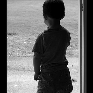
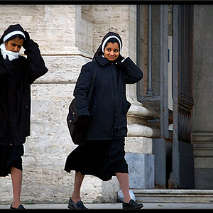
This is my first time shooting portraits semi-seriously. I did a free shoot for my friend so he has some photos for his upcoming website. I figured I'd share some here.

1:
EK9kXMa.jpg


2:
Vig8oW6.jpg


3: Showing "personality"
t0xJPXQ.jpg


4: Still showing "personality"
TIOX2Oi.jpg


I'm happy with the results, so is he. I'm not close to claiming that these are close to perfect, but I like them. What do you guys think?
 
That you are both happy is all that matters.
Is his web site intended to attract customers, or just for fun?

I think the one light was way to low and gives him a sinister look.
The eyes in shadow and the gray under exposed sclera aren't flattering.
If nothing else I would edit his eyes in #2 to brighten them up some.
The eyes are an important element in a portrait.

Thanks! Great call on the shadow on the eyes! I'll try to touch it up as best as I can. If not, I'll re-shoot. The look we are going for is a dark, almost "antique Gothic" theme across the board. A majority of the equipment used is from the late 1800's so we feel that we have a unique opportunity to make something of it.

However, I do agree that looking too sinister may not be the most attractive thing for people. I feel like I had the lighting too low to the ground than it should have been. I want shadows, but likely not where they ended up.

Cheers!
 
To be honest, I see these as a bit of a miss. In addition to Keith's excellent points above, there really isn't anything that screams "Blacksmith" to me in the set. No anvil, no forge, no hot iron being worked... I would try for some shots where the forge is actually visible and the viewer can tell instantly what he is. Without your explanation, and just looking at the pictures he could be a welder, fabricator, or one of a dozen other trades.
 
To be honest, I see these as a bit of a miss. In addition to Keith's excellent points above, there really isn't anything that screams "Blacksmith" to me in the set. No anvil, no forge, no hot iron being worked... I would try for some shots where the forge is actually visible and the viewer can tell instantly what he is. Without your explanation, and just looking at the pictures he could be a welder, fabricator, or one of a dozen other trades.
True. The main goal for these photos is to select one for the "artist's bio" page. Number 3 & 4 are more for fun and will not be used. But I figured I'd include them for fun.

I'm not disagreeing with you that additional "props" would make for great photos, but I do think that for what we are trying to accomplish it is not necessary. We're keeping it simple!

Being used directly on the website in addition to the inclusion of the French Pein hammer should be enough to get the point across IMHO. On its own, I agree that there would need to be more. But those photos are coming on a later date.

Thanks for the comment! :)
 
I think I would opt for a re-shoot; the from-below lighting is not flattering, and the one with the yellowish eye socket look reminded me of Donald Trump's oddly colored eye socket-and-fake-tan-orange-skin! I agree too about the lack of blacksmithing iconographic elements....like the anvil, for one, forge, hot iron, or metal of any kind.

Leather apron--? Check!
Hammer? Check!
Digital wristwatch with plastic band? Uh....check-mark!

I'd look at Rembrandt lighting as a good way to make these look dramatic.

As for the hammer....the inclusion of the UPC label and the SKU....on the shaft of the handle looks very much as if this is all play-acting...the big, white price/stocking tag just kills the shot. Having a modern 21st Century price tag on a blacksmith's hammer looks...odd. So does that digital watch.

The location, those neat walls though--awesome location!
 
The look we are going for is a dark, almost "antique Gothic" theme across the board. A majority of the equipment used is from the late 1800's so we feel that we have a unique opportunity to make something of it.
The pose in #1 is the best of this group, but as has been pointed out; the light is all wrong.

Change the position of the light (including any window light) and lower the intensity, too.

BTW: where are his forge, anvil, tongs, etc.?
 
That's why you keep your head over the work, sparks never fly though hammers. :)
 
Yeah, I think not taking pictures of him in his element (even if you pose him) is missing a real opportunity. The wall you have there is actually kind of neat, but the whole thing gives me a "we're off on a cave adventure to kill goblins!" more than a blacksmith feel.

Don't feel bad. You got closer than I did on my first try at something like this. Shoot it again!

Also, you may want to do some light touchup on his face to remove the blotches. Don't go crazy.
 
I actually like the first pic a lot. If you just posted the pic with no label I'd say "that's a cool pic of a coal miner being lit by a snake light" or something. I hope you don't take that the wrong way.
 
It bothers me in the first and second that the colors in is face are so close to the colors of the background. I would choose a background that contrasts more or perhaps these would work in black and white..
 

Most reactions

New Topics

Back
Top