
syphlix
TPF Noob!
- Joined
- Jul 23, 2009
- Messages
- 687
- Reaction score
- 1
- Location
- NYC
- Website
- www.gregorytran.com
- Can others edit my Photos
- Photos OK to edit
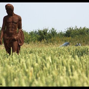
1. 
2:
3:
Hello. I haven't posted anything for c&c in a while, and thought it was time i get some feedback to know what i need to work on.
These photos were taken walking around different parts of the city.
Photo 1, the creep of the ivy, and the contrast of the colors is what caught my eye.
Photo 2, the lines, shapes, and colors (and i thought the person walking through it on her phone added to it as well, i had a shot w/ the doors alone but it felt too static). also, i liked the "swatch" of light that paints across the door and the scene...
Photo 3, i'm normally not a big animal shooter, but i was actually trying to take a photo of the knot in the tree that i thought looked like an animal face, and this guy crept into my viewfinder...
thanks in advance
")

![[No title]](/data/xfmg/thumbnail/37/37125-c083e505c2e7d8f15f717a96de782959.jpg?1619737883)


![[No title]](/data/xfmg/thumbnail/32/32929-22e23acc63d6ecb25e5ee941be87121f.jpg?1619735758)
![[No title]](/data/xfmg/thumbnail/34/34345-5642c495cae8d6c7bb83c28664146cf1.jpg?1619736381)