They are both nice shots. I prefer the B&W myself. My eyes are drawn to the sign. It has a feel from another era for me. Course the color one has more things to look at with that additional lighting in the window. Is that a reflection of the sign or another neon sign inside?
im partial to b&w ... but in this case, i like the color ... it adds a certain warmth and sets a different mood then the b&w ... i think the b&w doesnt finish the story ... it leaves me feeling empty
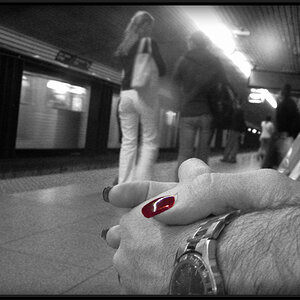
i like the b&w, but after playing with it in photoshop... you could use the sponge tool to desaturate the whole picture apart from the sign. this way you could have a b&w picture of the building, but the sign in color. also, if you do this you may want to dodge the corner of the building where the sign is.

")


![[No title]](/data/xfmg/thumbnail/31/31085-9786bf0c16c072633ecdfad477c23095.jpg?1619734600)


![[No title]](/data/xfmg/thumbnail/42/42494-ba608b57b09b00c0ee005a2360a510f5.jpg?1619740198)