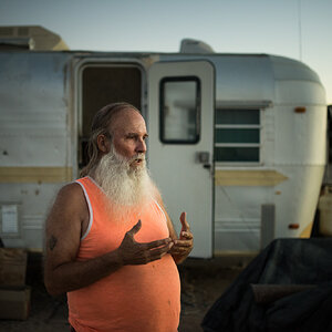
Nice shots bace! you need to adjust levels in most of these...they're a bit muddy.
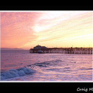
No. 2 is very nice...I'd just suggest cropping out or cloning out the bright areas to the right as it will make it a much cleaner shot focussing all attention on those beautiful blues
4, 5 and 6 are also nicely composed, clean shots.
good work man
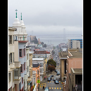
I agree also. A few PS adjustments and a little cropping here and there and I think you'd be pleased. I like the last two the best. On the second to last one, if you crop it to 8x10 to drop that board on the right, it would be the stand-out.
If you are ok with me trying a couple of ideas, let me know.
1. cropped it - i didn't constrain the ratio for this so it looks a bit skinnier than it should if you want to keep it to standard print ratios.
2. adjusted levels - pulled the highlight slider in towards the middle til it hit the midtone ramp up (hope that makes sense)
3. adjusted contrast - new layer >>unsharp mask: amount - 20%, radius - 50, threshold - 0. I then reduced this effect using the opacity slider for that layer; i reduced it to about 35% so it wouldn't be too contrasty.
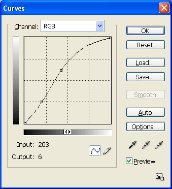
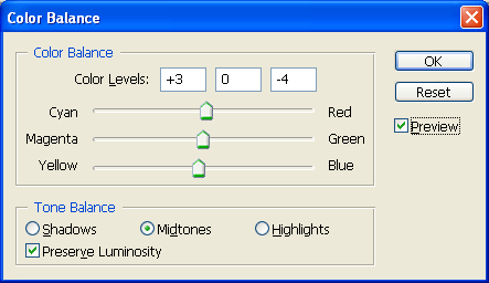
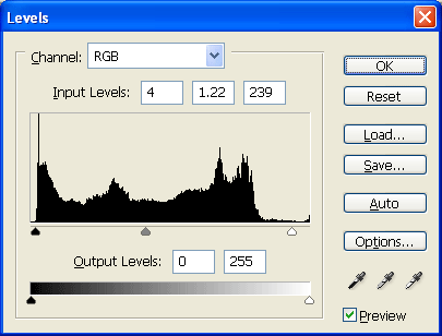
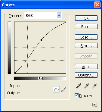
I really like Jon's edit. I usually find I have to revisit my changes, as it's rather easy to go too far the first run through. That's why I do everything I can as layers. I included screen caps of the adjustments I made.
--------
--------
--------
I also used smart sharpen on all but Heather5. That one has a bit of noise that became more pronounced.
You have so many options when doing this kind of work. There is no "right" amount of adjustment. I have found that playing around with different adjustments and crops has helped me "see" better when I'm looking through the viewfinder.


")


![[No title]](/data/xfmg/thumbnail/37/37626-4a6ffc3f17ab3a8e97170fda3276640e.jpg?1619738154)
![[No title]](/data/xfmg/thumbnail/39/39429-cfa441056f1e6a1995539dc87c794876.jpg?1619739028)
![[No title]](/data/xfmg/thumbnail/31/31752-fcbc5aa4a94154b9c273592aa37b8b1e.jpg?1619734991)
![[No title]](/data/xfmg/thumbnail/37/37627-c3d3ca879cdfbdb9e35acdcc7fcd4b3e.jpg?1619738154)