evening shadow patterns

thebeginning

TPF Noob!
Joined
Jan 10, 2005
Messages
3,795
Reaction score
30
Location
Texas
Website
www.danielcolvinphotography.com
Can others edit my Photos
Photos NOT OK to edit
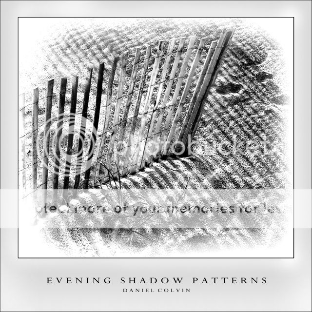
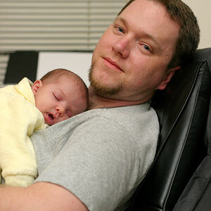
not sure if this one is that great. it came from me trying a new border technique, so it wasnt supposed to be a really powerful photo. now i'm wondering if i should keep it or just trash it because the picture is of essentially nothing. what do you guys think? should i keep this one, or should i just use this border style on another image when one comes around, or not even that? thanks so much for your critique and comments.

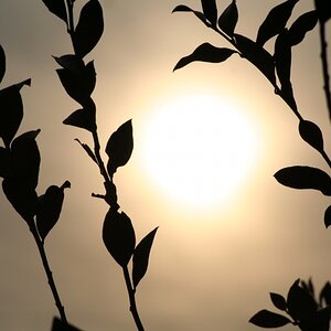
just a note, the softness was something i applied later, but i'm sure you experienced photoshoppers can catch that ;)

eveningshadowpatterns-web.jpg


edit:
here's another i decided to post, a little similar to the first.

fences3.jpg


edit 2:

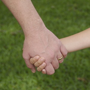
edit of the first one:

fences4-web.jpg
 
I'm not a big fan of the border style...but I think the photo is pretty decent. Something that I like about it is that it almost makes me squint like I'm outside. The textures and patterns provide a nice atmosphere. I think you've got something here, I'm just not too sure about the border :)
 
i like it all! the border & the photo. i'm not sure how you got the fence planks to have 100% different contrasting values, but it's pretty neat... not only that, but you have shadows on both sides of the fence too :) (possibly a hint at a second fence that is in perfect alignment with the first one?) the textures and shadows are awesome :)
 
I go for simple personally, so I'm not big on the border, but I like the shot. I feel the the contrast is good, but could go a touch darker.
 
i think the photo is good; the edge fading and contrast work really well for this shot. i'm on the fence :p regarding the border.
 
thanks for your thoughts, guys

i have another photo that i edited at the same time as this one, but i havent posted it. it's fairly similar, but more basic and simple (some of you might like it more). would it be ok for me to post it in this thread?
 
thebeginning said:
thanks for your thoughts, guys

i have another photo that i edited at the same time as this one, but i havent posted it. it's fairly similar, but more basic and simple (some of you might like it more). would it be ok for me to post it in this thread?

sure, if your looking for critique comments and dont mind the posibility of it getting ripped to pieces like mine earlier :lmao:
 
I really like both. I would take the bordering of the second and put it on the first image. I still think the first is a stronger image. Make the first as dark as the second, and you have really nice shot.
 
I think you nailed the first one. Edge fading rarely works in my opinion, but this to me is the exception. Wonderful lines broken by the dead plant, brilliant. If I was to nit pic, maybe the foot prints, put that seems to add to the photograph also. The second one is very good also, but the first has a strong mood quaility.
 
yalls help is much appreciated!

i've always had a pretty hard time with borders, it's just recently that i've been able to actually get some that i dont hate, and this one was a new try. about the footprints, I actually favored the second because the sand seemed smoother, but i guess they do work ok for the first one, it's just a matter of opinion i suppose.

yall must be getting alot nicer ;)
 
SPLENDID! :thumbup: :thumbup: :thumbup:

The best I have seen from you, yet!

Edit:
I did not realize this was the Critique section. I was too drained last night while posting the above comment.
Agrees with others for more contrast for both the photographs. Try playing with the USM. It is a mighty powerful tool.
 
In the first one the vignetteing works against the image and muddies it.
The second one is better - it's a much better image anyway.
In the first I think pushing up the contrast to give it more 'punch' would help things a lot.
Try playing with the contrast in the second one, too.
Images like this are very graphic - so you need to use graphic techniques. Higher contrast will exagerate the shadows - these are what the pictures are about so make sure people can see them.
Nice images, though.
 
I agree with hertz on bumping up the contrast in the first one. and getting rid of that white vignetting. I'd change it to a black vignetting (but that's just coz I'm stuck on my dark vignetting streak at the moment - and loving it!).

I like the frame in the first - but I don't like how the bottom is thicker than the other sides. But that's just me, I don't like it on any photo I see... except rarely.

Out of the two photos I'd have to pic the second as my favourite. It's great. I dunno if that soft look works for me in the first one, because you're dealing with something very strong and sharp.
 

Most reactions

Back
Top