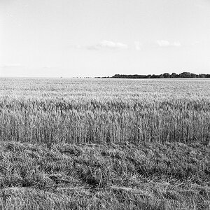
finals for my exhibition

Which do you like best?

  • 1

    Votes: 1 7.1%
  • 2

    Votes: 3 21.4%
  • 3

    Votes: 0 0.0%
  • 4

    Votes: 1 7.1%
  • 5

    Votes: 2 14.3%
  • 6

    Votes: 0 0.0%
  • 7

    Votes: 1 7.1%
  • 8

    Votes: 0 0.0%
  • 9

    Votes: 6 42.9%
  • 10

    Votes: 0 0.0%

  • Total voters
    14
As-shown, numbers 1 and 10 need to be removed from consideration, and the white vignette on the man in traditional armor/dress looks bad. I really like the green glass building shot. 2,3,5,7 are my favorites as shown.
 
5 is the only one out of the 10 I would consider showing. When it comes to showing/printing/selling, you really want to be as close to perfect as you can be. That is one of the ways you can set yourself apart. Everyone wants to be a photographer these days so you have to think this way. You are better off not exhibiting than being known for showing poor work. Be a brutal self editor, look at your photos objectively and start with the basics, like composition and exposure. If there is a problem, fix it, if it is not fixable, delete it. As others have said, the crooked horizons are a good example of that. In the first photo, the duck is looking out of the photo. Number 4 is crooked and off center. The vignette in 9 is really bad.
 

Most reactions

New Topics

Back
Top