First Engagement Shoot Critique Please

Terri Walsh

TPF Noob!
Joined
Sep 19, 2007
Messages
187
Reaction score
0
Location
Calgary, Alberta
Can others edit my Photos
Photos OK to edit
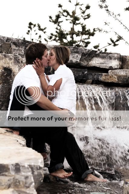
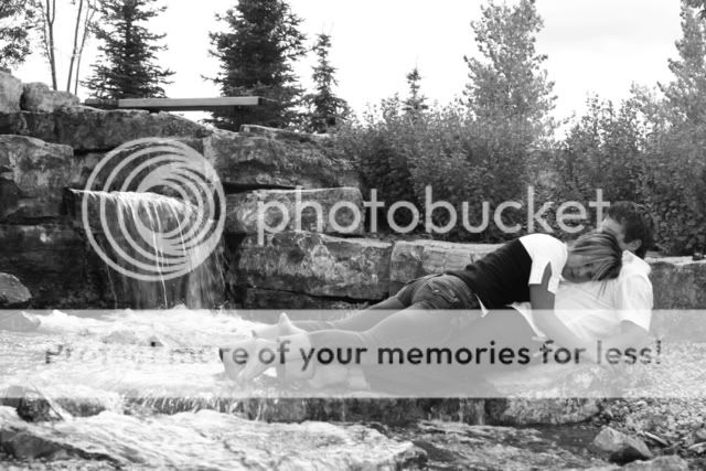
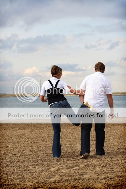
These are a few shots of the Engagement session I did yesterday for a family member. I would love to know what you think...
I did alter them a bit in photoshop for the desired effects.
I used my Canon 30D, 24-105mm and 50mm, 1.4.

Thanks,
Terri

IMG_7948cteastained.jpg

IMG_7924editiedrouge.jpg

IMG_7906cburn.jpg

gavinsIRmix.jpg

IMG_7954ceditedglowbaby.jpg

IMG_7887overlay.jpg
 
I really like 1. Everything just looks right to me.

Number 4 kinda makes the girl look like a dead log...
 
Thanks for your feedback Cero. In #4, I have to say it was quite cold, and they were uncomfortable and it shows! #1 was my fav too.
 
I really like how you captured the subjects, but I find the water falls in most of them to be so distracting, that my eyes almost miss the couple. Hope you don't mind the feedback, it's only my opinion.
 
I like the shots but I think the most powerful engagement shots show the couple in some sort of tight relationship. I would crop to a 4x5 ratio to fit the standard 8 x 10 frame.

img7948compsx9.jpg
 
I agree with your crops 100%. I think she has some really nice photos but the couple gets lost in all the open space.


I like the shots but I think the most powerful engagement shots show the couple in some sort of tight relationship. I would crop to a 4x5 ratio to fit the standard 8 x 10 frame.

img7948compsx9.jpg
 
My opinions:

#1 is too intimate, especially since her pants are dark making it look like she's straddling him. I don't think engagement pics should necessarily say "hubba hubba!"

#2: they didn't hold still enough for your long exposure. Plus she looks frumpy and you can't really make out enough of her face.

#3: her face is covered again. They both look a little stiff. He should probably lose the shades!

#4 looks painful. This shot seems to stress their weight in an uncomfortable way.

#5 is the best of all because we can at least see who is engaged. However, this particular composition just isn't doing it.

#6 is my favorite, and would make a good complimentary photo for the back of an announcement or something.
 
Not too sure about the black and white one, aside from the posing, there isn't much contrast between them and the background to make them stand out..

I like the last one though great "and they lived happily ever after" feel to it
 

Most reactions

Back
Top