jfrabat
No longer a newbie, moving up!
- Joined
- Apr 15, 2012
- Messages
- 595
- Reaction score
- 60
- Location
- Panama, Central America
- Can others edit my Photos
- Photos OK to edit
First of, let me start by saying that I am aware that the first thing I need to do is get me a new monitor; due to budget and hardware issues, at this time, I am working with an old Sony LCD 32" tv (their basic line-up one) as a monitor, and I just can't get the colors right (the color gamut is just not enough, so things that seem perfect in that monitor, look horrible in others). So, having said that, I know there are color tones that are wrong in these, and I know some cloning looks a bit too obvious (they did not look that way at home, but looking at them in the office, I can certainly tell!). Those 2 issues I plan to fix when I upgrade my monitor, but other than that, what would you advise in these family portraits:
"Traditional" family portrait:
Since I do not have a backing, I got 6 yards of white cloth (was something like $20) and hung them on the window (I had to clone out some folds and wrinkles). I then used two sppedlights (Sony HVL-58AM and Sony HVL43AM) on tripods as lights. Since the light was too hard, and I did not have any photography umbrellas, I had to improvise, so I took some rain umbrellas that were black on the outside and silver on the inside, and used them as reflecting umbrellas (I had to tape them to the stands).

"Humor" family portrait:
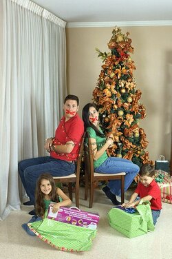
After the above effort, we tried something a bit more humorous; location was selected because we could move most of the furniture out of the way, and backlight was not too harsh. I also used the same flash contraption as above (note: I already ordered a couple of cheap lightstands with umbrellas from ebay!). unfortunately, the china cabinet could not be moved any further, and you can still see the shadow on the right side, and, because of space limitations, I could not place the lights in a way so as to avoid it. I tried cloning out the shadow, but made a mess of it last night, so I just undid the changes. I also envisioned my kids with a little more mischievous look, but they are difficult models to control... Especially when you are tied up to a chair with tape over your mouth! But even so, I like how it came out (my idea is to write some text in the upper left hand corner).
Anyway, any help is GREATLY appreciated!
Felipe
"Traditional" family portrait:
Since I do not have a backing, I got 6 yards of white cloth (was something like $20) and hung them on the window (I had to clone out some folds and wrinkles). I then used two sppedlights (Sony HVL-58AM and Sony HVL43AM) on tripods as lights. Since the light was too hard, and I did not have any photography umbrellas, I had to improvise, so I took some rain umbrellas that were black on the outside and silver on the inside, and used them as reflecting umbrellas (I had to tape them to the stands).

"Humor" family portrait:
After the above effort, we tried something a bit more humorous; location was selected because we could move most of the furniture out of the way, and backlight was not too harsh. I also used the same flash contraption as above (note: I already ordered a couple of cheap lightstands with umbrellas from ebay!). unfortunately, the china cabinet could not be moved any further, and you can still see the shadow on the right side, and, because of space limitations, I could not place the lights in a way so as to avoid it. I tried cloning out the shadow, but made a mess of it last night, so I just undid the changes. I also envisioned my kids with a little more mischievous look, but they are difficult models to control... Especially when you are tied up to a chair with tape over your mouth! But even so, I like how it came out (my idea is to write some text in the upper left hand corner).

Anyway, any help is GREATLY appreciated!
Felipe


