OP
OP
- Joined
- Sep 2, 2005
- Messages
- 14,455
- Reaction score
- 3,328
- Can others edit my Photos
- Photos OK to edit
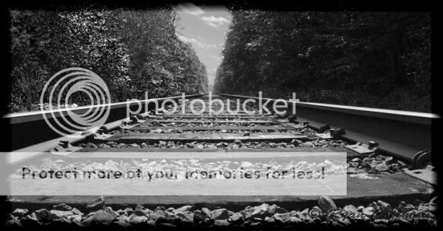
First of the many shots to come taken with my new camera. I wanted to try doing some black and white shots but with a little more contrast. I had seen some examples or railroad tracks on here and since I live right next to a railroad, I wanted to go out and shoot something I have never shot before.
Hey big!
I'll be right up front and tell you that railroad track shots have really got to be something unique to get my attention, so whenever I see one I tend to be like "Oh look... a shot of a railroad track." Overall, I have that reaction for this shot.
That being said, here are some of my impressions...
1. You have the track pretty much dead center, but it isn't PERFECTLY so. If you go this route (in my book) you need to make sure it is dead-on with no perspective issues. (I think the shot also isn't perfectly level)
2. That division between the two sides of forest in this shot is a bit weird for me. The part of sky visible is small and oddly shaped and winds up being somewhat distracting.
3. I think where you have a shot of something straight trailing off into the distance and where the forest on either side lacks any particular interest (and where you appear to have had a nice sky) that the thing to do might have been to take this shot in portrait instead of landscape. It would have accentuated the sense of distance, and if you kept the exact perspective, might have made your eyes trail into the horizon and then up into the sky, which would have been a cool effect.
4. Something makes me think that the angle on the tracks is too aggressive... I can't really see them trailing off that far. I almost want to raise the camera up a bit while continuing to point down so I can see more of the actual track.
5. You have the horizon at dead-center which generally doesn't work as it doesn't lend visual tension to the shot, making it too easy to view and just move past. Look up the rule of thirds. (my portrait suggestion would help this also)
Just some thoughts. Keep at it!


")

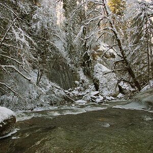
![[No title]](/data/xfmg/thumbnail/34/34064-66d345cd6eebe4b9f97597e03008d3b7.jpg?1619736260)
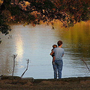
![[No title]](/data/xfmg/thumbnail/39/39291-a89dc472765e04f66f617dd9acc8030d.jpg?1619738958)
![[No title]](/data/xfmg/thumbnail/31/31978-02cde49248ebdf1b82fba5c899e08378.jpg?1619735136)
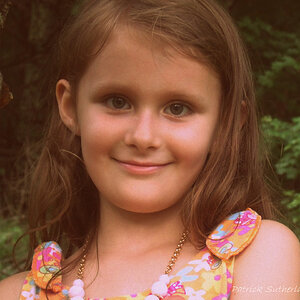
![[No title]](/data/xfmg/thumbnail/34/34062-c0c9c0a752bc1af58237eff1ec850163.jpg?1619736259)