I like the site. I find it easy to navigate. My biggest problem is with the front page, all that black and those tiny little blue letters up left....hard to see.
You sure have been a busy boy; you've added tons of stuff since I last looked! Getting better all the time. :thumbsup:
hmm, only advice is make it obvious that that pic is the enter page, if you need some help with any of the programming or a lille news posting script i recon i can whip something up for you mate, no charge
For a start, in your code you have.
Code:
<title>New Page 1</title>
You wanna change it so it says something like this.
Code:
<title>Pheonix Photo</title>
This is one of the few things i could help you alter to make ur site look a lille more profesional, although it looks good now
Have you everbeen in a book shop and not taken any interest in a best seller with an uninspiring cover ? your front page , I think needs something doing with it to Grab the attention more
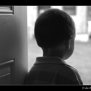
Your pics are spot on, in particular the B & Ws. the model shots are V. good too !!! (please tell me you didn't shoot Keira Knightly!)
Cool pics - "Gracie" is a fantastic shot, but you should fix the light line on the forehead - just run a healing brush over it once to make it less contrasty. Would be awesome! All the b/ws seem to need a bit of contrast, but that's just my style. I like it. Didn't look at much of the 'other' gallery, but the other 3 are tip-top.


 Getting better all the time. :thumbsup:
![[No title]](/data/xfmg/thumbnail/42/42059-61b97bbebb00e6276672551f4e3b3e43.jpg?1619739995)
![[No title]](/data/xfmg/thumbnail/42/42057-1509913128bb1db2bc11235c05832fd4.jpg?1619739993)
![[No title]](/data/xfmg/thumbnail/36/36658-525087f40e1bdbfe8b995ce4296ef4a6.jpg?1619737675)
![[No title]](/data/xfmg/thumbnail/39/39499-b11b4321c0f029e3a5523ccab621b71c.jpg?1619739057)
![[No title]](/data/xfmg/thumbnail/42/42056-76026251cb5ebb85b4a4d281d36121d8.jpg?1619739992)
![[No title]](/data/xfmg/thumbnail/35/35932-28690c4fc247cf491230e47fc70ebeb5.jpg?1619737235)
![[No title]](/data/xfmg/thumbnail/36/36657-3774cdd7ebbafa5ccac2741386b9949a.jpg?1619737675)