
Rosy
No longer a newbie, moving up!
- Joined
- May 9, 2011
- Messages
- 1,289
- Reaction score
- 328
- Location
- Raleigh NC
- Can others edit my Photos
- Photos OK to edit
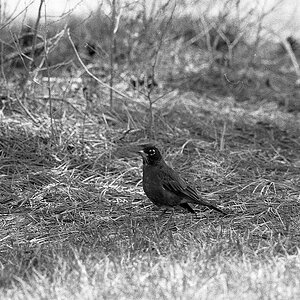
It's actually something I achieve with a "curves" adjustment layer. I do add contrast, but I pull the very bottom point of the shadows up a little when creating an "S" curve, and it just barely starts to soften the shadow areas up a bit . I really enjoy the look it gives.
Thanks again
")
![[No title]](/data/xfmg/thumbnail/31/31977-2b717e032201241cbeae8226af23eba4.jpg?1619735136)
![[No title]](/data/xfmg/thumbnail/31/31091-00a77a1c08cddcf7dc236d9317f868d2.jpg?1619734607)
![[No title]](/data/xfmg/thumbnail/36/36300-760519cb9a8ebbfc57cc3d1fda5dd37c.jpg?1619737494)
![[No title]](/data/xfmg/thumbnail/36/36302-6ee4929dfdf80290ffd73704693e860f.jpg?1619737496)
![[No title]](/data/xfmg/thumbnail/31/31978-02cde49248ebdf1b82fba5c899e08378.jpg?1619735136)