Lauren C&C - lots of pics

SquarePeg

hear me roar
Staff member
Supporting Member
Joined
Mar 18, 2013
Messages
15,467
Reaction score
15,373
Location
Boston
Can others edit my Photos
Photos OK to edit
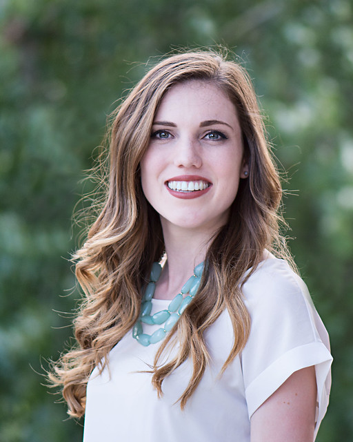
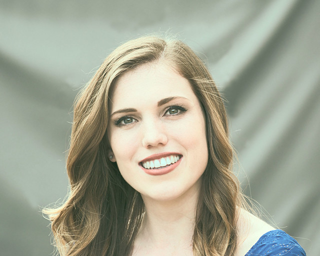
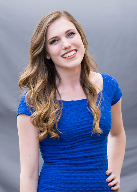
My goddaughter asked me to take some photos for her resume reel. She's in college studying broadcasting and wants to go into sports media. She'll be using the reel to apply for internships. It's mostly clips of her broadcasting for the campus tv station but she said most people have a couple of still shots at the beginning and the end of their reel... I definitely need the practice taking people pics so it was a good trade off. Anyway... she is happy with the way these came out so that's good but I know they could be better. Would love some critique/suggestions, especially on my post processing but comments welcome on any aspect of the photos. I really have no idea how to edit portraits, I just know I don't like the overly smoothed look. This first one, I've basically increased the exposure a bit in ACR then sharpened them in PSE and cropped. The second version I used a pre-set filter. What do you think?
1.
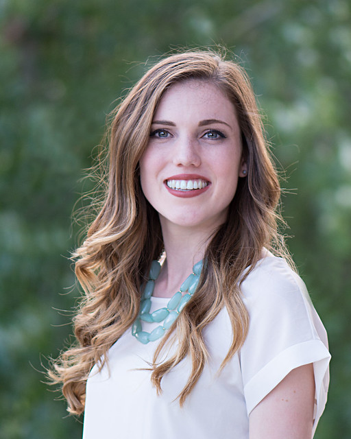
Lauren_5485_edited-1 by S Catalano, on Flickr
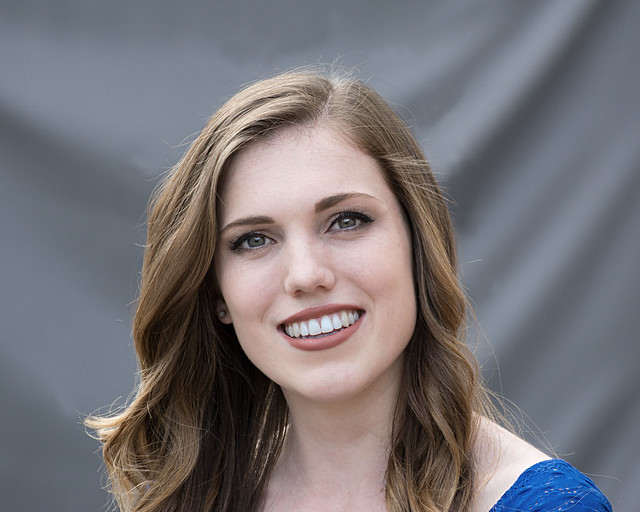
2.
Lauren_5485_edited-2 by S Catalano, on Flickr

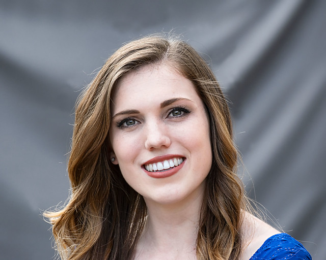
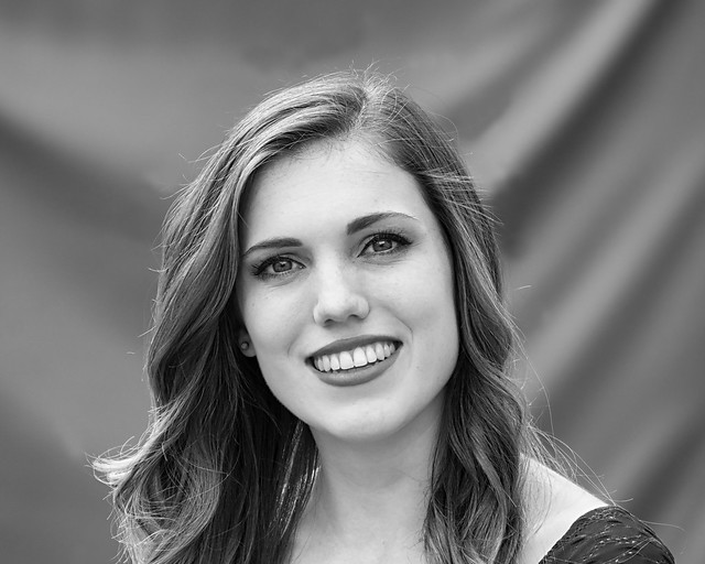
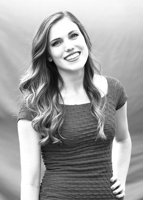
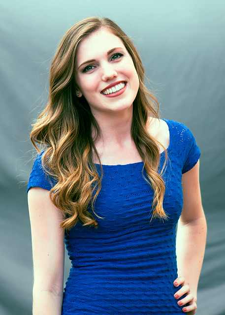
Here are 4 versions of this one. Again the first is just sharpened and cropped then I tried some Topaz portrait pre-sets on the others. (I know I'm all over the place but I don't usually do people photos so really no clue on where to begin) I like the desaturated look but it's a bit too non traditional for the reel. She liked the versions with the contrasty colors. Suggestions?
3.
Lauren_5403_edited-1 by S Catalano, on Flickr
4.
Lauren_5403_edited-2 by S Catalano, on Flickr
5.
Lauren_5403_edited-3 by S Catalano, on Flickr
6.
Lauren_5403_edited-4 by S Catalano, on Flickr

Last set.
7.
Lauren_5431_edited-1 by S Catalano, on Flickr
8.
Lauren_5431_edited-3 by S Catalano, on Flickr
9.
Lauren_5431_edited-2 by S Catalano, on Flickr


I still have some more to edit...
 
I think in the first one the WB is off; seems too red to me, but other than that, it's a nice image. I can't see any real difference between the two examples, but I'm not on my good monitor ATM either. I'm really not a fan of the second set; the big wrinkles in the backdrop, and what seems to me an awkward crop, If you do use one, it should be #4; for work like this, just like comp cards, you don't want to be artistic or fancy, you want the truth (mostly). In the last set #7 would be the pick, but again... the background bothers me a bit, and the cropped hand even more so. As well, in all of these you've posed her in a masculine way (head toward the low shoulder) which is acceptable for women, but in this case, I think it would have looked better to have gone with a traditional feminine pose.

That's not to say that these are bad in way; they're not. But... they could be better!
 
The first set are my faves and I prefer the 1st over the 2nd.. but barely. I like the 2nd too but feels like the highlights are just a tad too much, exposure looks more appropriate in the 1st to me.

I haven't calibrated lately but WB seems quite off in most. Warm up that first set and reduce the reds from what I can tell.
 
Your photos said okay to edit so hopefully you don't mind.. I'd probably go a tiny bit more glamour on it, I did not adjust anything on her skin specifically.. just to the entire image :)
28961118572_22ec5fe3d3_o.jpg
 
I think in the first one the WB is off; seems too red to me, but other than that, it's a nice image. I can't see any real difference between the two examples, but I'm not on my good monitor ATM either. I'm really not a fan of the second set; the big wrinkles in the backdrop, and what seems to me an awkward crop, If you do use one, it should be #4; for work like this, just like comp cards, you don't want to be artistic or fancy, you want the truth (mostly). In the last set #7 would be the pick, but again... the background bothers me a bit, and the cropped hand even more so. As well, in all of these you've posed her in a masculine way (head toward the low shoulder) which is acceptable for women, but in this case, I think it would have looked better to have gone with a traditional feminine pose.

That's not to say that these are bad in way; they're not. But... they could be better!

The first set are my faves and I prefer the 1st over the 2nd.. but barely. I like the 2nd too but feels like the highlights are just a tad too much, exposure looks more appropriate in the 1st to me.

I haven't calibrated lately but WB seems quite off in most. Warm up that first set and reduce the reds from what I can tell.


Thank you both for your feedback. I'll see if I can tweak that WB somehow. From the outfit I know that was our second location and we went from being in the shade on a mostly sunny day to having overcast skies and being in the open so I probably should have adjusted for that in post. I was using Auto WB while shooting.

I totally agree about the background wrinkles. She had sent me some shots she wanted to try to duplicate and most of them were indoors which I just don't have the equipment for so we rigged a sheet in the shade in our yard but it was windy and it kept rumpling. I'll see if I can smooth them out a bit or use some of the ones where she was further away from the backdrop so it is less in focus. The posing is definitely a work in progress. We mostly copied the ones that she found that she liked. I know I have a few where I didn't crop off her hand! Will have to work on those next.

Thanks again!
 
Your photos said okay to edit so hopefully you don't mind.. I'd probably go a tiny bit more glamour on it, I did not adjust anything on her skin specifically.. just to the entire image :)

Totally ok with anyone trying their own edit. I like that a lot! As I said in my original post I'm totally inexperienced at editing portraits. Can you elaborate on the "glamour"? Is that a filter in LR or PS? I'm using PSE11 and Topaz plug ins...
 
I used a Lightroom preset of my own that I made and tweaked from there.. mostly in the WB department is all. I just went for something that would give her more of a pop and more contrast, more vibrant coloring, etc. I am happy to look at exactly what the adjustments were to share if you'd like :)
 
I used a Lightroom preset of my own that I made and tweaked from there.. mostly in the WB department is all. I just went for something that would give her more of a pop and more contrast, more vibrant coloring, etc. I am happy to look at exactly what the adjustments were to share if you'd like :)

I'd love to know the details, thank you! I found a couple of tutorials for both PSE 11 and topaz plug-ins that I'm going to try to get to this weekend. I really never done any of the tutorials around portraiture so I guess I need to start doing that if I plan to take more people photos Surprisingly, I enjoyed it much more than I thought I would.
 
I use Gimp so I can't tell you a thing about other editing software. I would just warm the images up a bit, and bump the clarity a smidge. I like to keep things simple. I think the images are very nice.
 
My lightroom decided to remove this file for some reason lol so now I can't see exactly what I did but most of my play includes reducing highlights, bumping shadows, a little contrast increase, clarity increase for sure, vibrance increase, and then the white balance I warmed it and reduced reds by going more green. Hope this is helpful :)
 
First of all you did a good job on these, she has a very natural look. :)

I hope you don't mind, but I took a shot at editing one.
28961118572_915d1d3d9d_z.jpg
 
^^ i like this edit a lot
 

Most reactions

New Topics

Back
Top