Jen Puleo
TPF Noob!
- Joined
- Jul 3, 2008
- Messages
- 42
- Reaction score
- 0
Looking for ways to improve my photos. Thanks for any tips/advice.
Jen
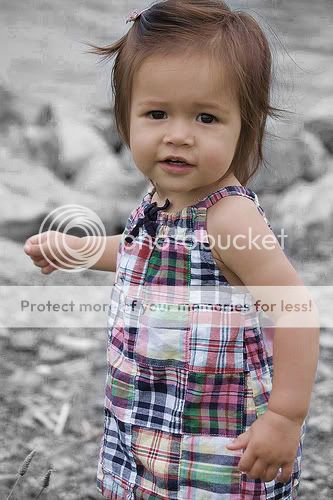
1. My Girl

These are from a session I did for another mom. In the first I took out a lot of color, I didn't want B&W but less color. And I know the very top of her head is chopped off
2.

3.

4.

Jen
1. My Girl
These are from a session I did for another mom. In the first I took out a lot of color, I didn't want B&W but less color. And I know the very top of her head is chopped off
2.
3.
4.


![[No title]](/data/xfmg/thumbnail/37/37245-5f15b292311b21913f10cc41f40682ba.jpg?1619737952)
![[No title]](/data/xfmg/thumbnail/39/39289-c5ea6a611707fdd5786347f4a67d63ae.jpg?1619738957)

![[No title]](/data/xfmg/thumbnail/30/30986-0fbf9af8f70b46ce37aeb237ba68b573.jpg?1619734551)
![[No title]](/data/xfmg/thumbnail/30/30989-2ed4e52fa80fcd0ba553c515ffc589cd.jpg?1619734553)

![[No title]](/data/xfmg/thumbnail/40/40308-f92e28f094216c151f3ad1fd7453c99b.jpg?1619739413)