Navigation
Install the app
How to install the app on iOS
Follow along with the video below to see how to install our site as a web app on your home screen.

Note: This feature currently requires accessing the site using the built-in Safari browser.
More options
You are using an out of date browser. It may not display this or other websites correctly.
You should upgrade or use an alternative browser.
You should upgrade or use an alternative browser.
Missing something
- Thread starter NoChance
- Start date

newrmdmike
TPF Noob!
- Joined
- May 8, 2006
- Messages
- 2,107
- Reaction score
- 1
- Location
- it varies.
- Can others edit my Photos
- Photos NOT OK to edit
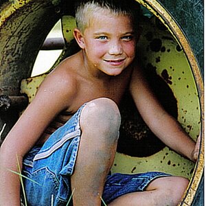
not to be mean, but its missing alot, like interesting light, contrast, good composition . . . i would throw this one out
I don't know I guess I am kind of attracted to that like kind of symmetrical feel, but I guess that they can't all be beauties..... Thanks for your honesty.newrmdmike said:not to be mean, but its missing alot, like interesting light, contrast, good composition . . . i would throw this one out
newrmdmike
TPF Noob!
- Joined
- May 8, 2006
- Messages
- 2,107
- Reaction score
- 1
- Location
- it varies.
- Can others edit my Photos
- Photos NOT OK to edit
if there is somthing you think is there then don't let anyone tell you otherwise, just follow what you feel. .. something really good could come of it.
oldnavy170
TPF Noob!
- Joined
- Sep 7, 2006
- Messages
- 2,236
- Reaction score
- 0
- Location
- Rochester, New York
- Can others edit my Photos
- Photos OK to edit
Don't throw it out!!!! Its all about what you think about it. Even though its not a perfect photo doesn't mean that it doesn't mean something to YOU!!!!
I
Iron Flatline
Guest
Crop it tighter on the left and the right, so that you are primarily aware of the two arches. Possibly then also the bottom and top. There's some color, contrast and saturation work that could be done as well.
Dunno, is this ok to edit? I'd take a stab at it, but you need to give us the ok if you want to be shown in addition to typed suggestions.
Dunno, is this ok to edit? I'd take a stab at it, but you need to give us the ok if you want to be shown in addition to typed suggestions.
I
Iron Flatline
Guest
Oh, what da heck, I can always take it back down if you don't allow editing:
I cropped, I did some curves adjustments, and I cloned some Ivy over that grey tarmac driveway on the right. I am out of time, but a next step would be to add some contrast and color into the brick.

I cropped, I did some curves adjustments, and I cloned some Ivy over that grey tarmac driveway on the right. I am out of time, but a next step would be to add some contrast and color into the brick.
rmh159
TPF Noob!
- Joined
- Jun 13, 2006
- Messages
- 1,028
- Reaction score
- 0
- Location
- Milwaukee, WI
- Can others edit my Photos
- Photos NOT OK to edit
LOL great creative advice.
Unless a pic is blurry and completely shot to hell I wouldn't throw out anything. You never know how you can save it and at the least you can learn from it.
newrmdmike said:not to be mean, but its missing alot, like interesting light, contrast, good composition . . . i would throw this one out
Unless a pic is blurry and completely shot to hell I wouldn't throw out anything. You never know how you can save it and at the least you can learn from it.
David
TPF Noob!
- Joined
- Aug 22, 2006
- Messages
- 96
- Reaction score
- 11
- Location
- Suffolk, UK
- Website
- www.davidbazlinton.com
- Can others edit my Photos
- Photos NOT OK to edit
I very rarely delete images, as my two external hard drives are testament to. You never know when you'll need a bit of extra foliage, brickwork or some other thing to clone or otherwise use in another image.
I have several techniques that I use on an image before even considering deletion, because you never know what interesting effects you'll achieve until you try. I also find I learn new stuff playing with these 'more challenging' images.
If an image looks a bit flat or otherwise is missing something, one such technique I use is to overlay one of the colour channels as a luminosity layer. Sometimes the results can be very useful, especially on faces. The red channel overlayed gives smoother skin tones and removes blemishes, whilst the blue channel gives you darkened skin tones and also enhances any freckles, lines or other blemishes.
On the image above I have used the blue channel as a luminosity layer, and then adjusted the curves to darken the image slightly, before playing with a selective colour adjustment layer to improve some of the colour tones. The resulting image is not perfect, but I think it gives a bit more pop to the original.
Click here for image.
The second image was just for fun and has the blue channel overlayed, but has then been desaturated and then a curves adjustment layed added, using an increasing sine wave curve. I then added the original image above, set the blend mode to colour and reduced the saturation to 50%.
Click here for image.
The image could do with some cropping maybe, or selective cloning as there are one or two distracting details, but have fun and play, you'll learn loads by doing so.
David
Alex_B
No longer a newbie, moving up!
- Joined
- Aug 30, 2006
- Messages
- 14,491
- Reaction score
- 206
- Location
- Europe 67.51°N
- Can others edit my Photos
- Photos NOT OK to edit
I like Iron's crop.
maybe further go black or white or even false colours.
If you have a chance to shoot again, place something in the centre, just something small, not an elephant")
maybe further go black or white or even false colours.
If you have a chance to shoot again, place something in the centre, just something small, not an elephant
Iron Flatline said:Oh, what da heck, I can always take it back down if you don't allow editing:
I cropped, I did some curves adjustments, and I cloned some Ivy over that grey tarmac driveway on the right. I am out of time, but a next step would be to add some contrast and color into the brick.
hmm sorry I was at schiool. Yeah its fine if you edit it. uhm. I like this one, I was going for that emphasis on the arches, but the green kind of drowned out what I was going for. This is better. How would one go about repeating what you did via photoshop. Because this is a reduced quality photobucket file, so I would rather do it on the quality file? Mind explaining about hte whole color correction thing? Thanks everyone else as well for your comments.
- Joined
- Jun 17, 2005
- Messages
- 349
- Reaction score
- 5
- Location
- Irvine, Orange County, CA
- Can others edit my Photos
- Photos OK to edit
Maybe its just me but it still seems like you are missing a focus. (maybe thats a good thing though at times) The picture doesn't really draw me 'into' the picture. Rather it divides my attention and leads me out of the photo.
I
Iron Flatline
Guest
NoChance, I assume you mean the brick color. I would create a second layer (CTRL-J) and then click Add Layer Mask. You then use the brush tool to highlight the area you want to work on. You can turn on and off the layer underneath it (by clicking on the eye) to see if you're selecting it correctly. Then change the contrast, saturation, etc of that particular layer. Best is if you create a new Adjustment Layer, but you'll have to tie it to the new layer. I do that by hovering by cursor right between the new layer and the adjustment, and then holding down the ALT key. It will show you two circles overlapping - hit enter and it locks them together.
It's Photoshop, there's 30 ways to do everything, 20 of which are better, more detailed, and more appropriate than what I just described. <shrug>
It's Photoshop, there's 30 ways to do everything, 20 of which are better, more detailed, and more appropriate than what I just described. <shrug>
I kind of agree with you. I wish that there was no trees/bushes in between the two arcs, that way it kind of like draws you towards the center, but hey not everything goes your way in life.zedin said:Maybe its just me but it still seems like you are missing a focus. (maybe thats a good thing though at times) The picture doesn't really draw me 'into' the picture. Rather it divides my attention and leads me out of the photo.
Iron Flatline said:NoChance, I assume you mean the brick color. I would create a second layer (CTRL-J) and then click Add Layer Mask. You then use the brush tool to highlight the area you want to work on. You can turn on and off the layer underneath it (by clicking on the eye) to see if you're selecting it correctly. Then change the contrast, saturation, etc of that particular layer. Best is if you create a new Adjustment Layer, but you'll have to tie it to the new layer. I do that by hovering by cursor right between the new layer and the adjustment, and then holding down the ALT key. It will show you two circles overlapping - hit enter and it locks them together.
It's Photoshop, there's 30 ways to do everything, 20 of which are better, more detailed, and more appropriate than what I just described. <shrug>
haha thanks, I will give it a try. See what happens.
Most reactions
-
 421
421 -
 319
319 -
 291
291 -
 274
274 -
 271
271 -
 232
232 -
 197
197 -
 182
182 -
 170
170 -
 162
162 -
 144
144 -
 141
141 -
 135
135 -
 126
126 -
 103
103
Similar threads
- Replies
- 11
- Views
- 923
- Replies
- 6
- Views
- 463
- Replies
- 0
- Views
- 459


![[No title]](/data/xfmg/thumbnail/41/41930-3f8741ecabbbfd4d67ade3e339078814.jpg?1619739946)