Monitor Calibration

xLastShotx

TPF Noob!
Joined
Dec 16, 2008
Messages
19
Reaction score
0
Location
California
Can others edit my Photos
Photos NOT OK to edit
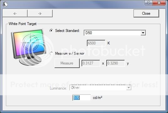
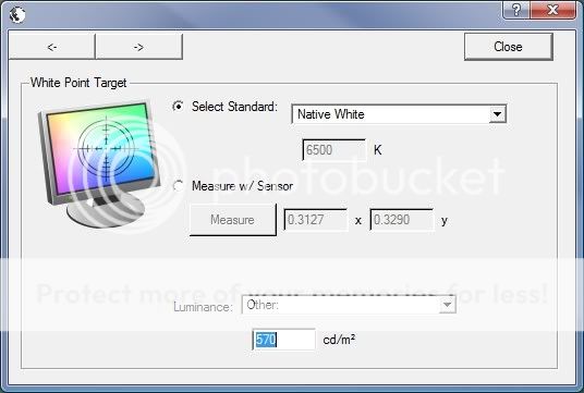
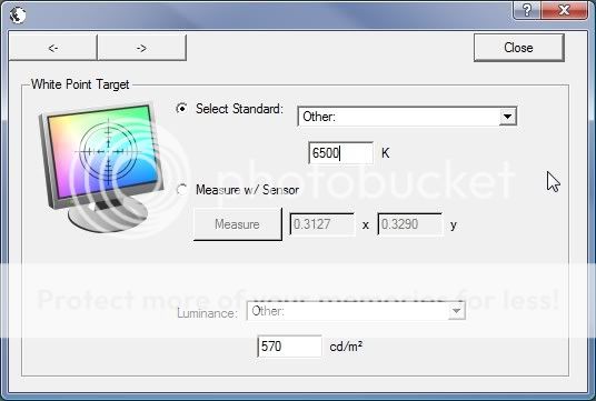
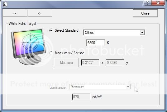
I have a Spyder 2 Express, and the ColorEyes Display Pro software. But I have no idea what to calibrate my monitors to for photography.

I'm not really sure what info you guys would need to help me out, so just post what you need and I will provide more information.
 
Can't you just calibrate to what the hardware you bought tells you to calibrate to?

...If not, why did you buy it?
 
It doesn't really say exactly what to calibrate it to, this software isnt just for photography so there are tons of options, and not all those options are rite for photography. I was that someone here may know about monitor calibration, and could help me figure out the best settings for photography.


1.jpg

2.jpg

3.jpg

5.jpg

6.jpg

7.jpg

9.jpg

10.jpg

11.jpg

12.jpg

13.jpg

14.jpg

15.jpg
 
Last edited:
Calibration is so the monitor show true colors, no matter what it is. If it is calibrated, then photos will show up right. Go to Sypder's site and read the support pages. It should explain calibration to you.
 
So is my Spyder software. Mine is Spyder 2 Express (2.2) and its simple and pretty much does everything itself. I just got test prints back from Millers Professional Imaging, and my prints matched their color corrected prints spot on.
 
Its different because that is the ColorEyes Display Pro software, its made by a different company.

Ill give the stock Spyder 2 Pro software another try, I just really like the way that this software worked for calibrating two monitors (I have dualscreen and Id like the brightness and color to be exactly the same)

My main question is what white point target should I use, D50, D65, 6500k, or Native White.

I'm leaning towards D65 or Native white. 6500k is not ideal for multiple monitors since 6500k is not a specific color so it is almost impossible to get all of my monitors to match.


After doing some research it appears that D65 2.2 Gamma is the best for photo editing.
 
Last edited:
You should calibrate to native white unless you're comparing your prints to the monitor using a colour box that is calibrated to a certain white point.

Your eyes adjust to the colour balance. Any deviation the monitor is forced from it's native white point often results in a loss of brightness (very expensive monitors excepted). If you want to calibrate to a standard point none the less pick the closest one to the native. I.e. My monitor measures a native point of 5400K so I calibrated to D55.

The other options are the same. If you're calibrating to get accurate colours then leave the settings at native or maximum. If you're calibrating to a specific process then you read up on what it's supposed to be. I.e. AdobeRGB profile based workflow recommends a white point of 160candellas and a contrast ratio of 280something:1, viewed in a room with lighting of no more than 35lx. But actually setting your screen to this would cause it to deviate from it's ideal display settings.

Make sure:
White point is close to native.
Room is very dark compared to the screen.
Gamma is set at 2.2

The rest is overkill unless you actually work for Pantone or something similar.


Thanks a bunch, That was the answer I was looking for :)
 

Most reactions

New Topics

Back
Top