Not bad overall but the light behind him and to our left is too hot. I would also would have used a reflector below the camera and somewhat to the right.
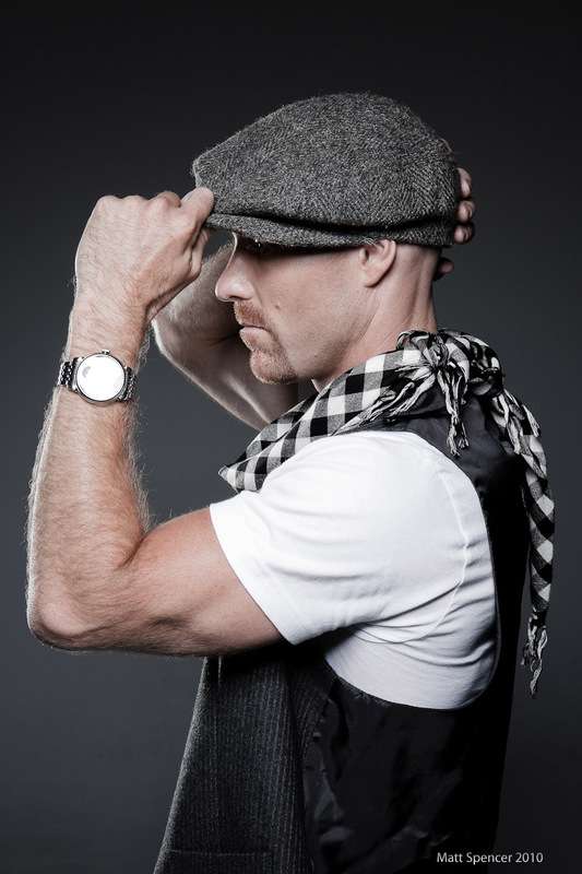
#1 is nice enough but a bit boring.
#2 would be a reject in my studio because of the watch.
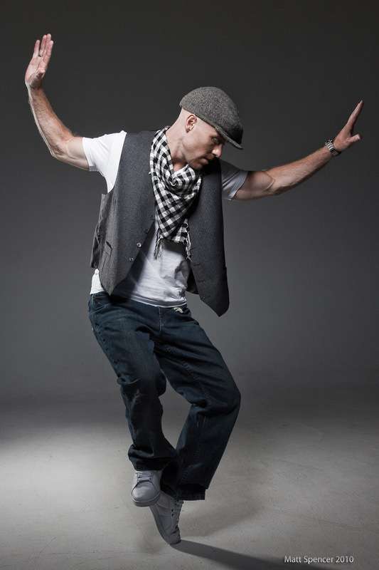
#3 I love his move in this one. The hair light doesn't seem as hot although the shadow on the floor says otherwise but what bothers me the most is his left hand. It looks too thin. Twisted just the slightest bit and this would have been a very nice image. Try and PP the shadows on the floor.
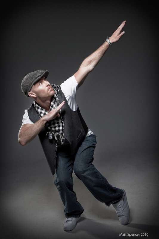
#4 is very nice. Just fix the floor shadows.
#6 would be better if he was looking more towards you (with his eyes, not his head) so that we would have more than white showing.
As far as #2, I agree the watch kills it, but there's nothing I can do without reshooting it. And since I shot these at a photo/model workshop, the space and lighting equipment aren't available anymore. All the recovery and highlight tweaking in the world isn't going to bring it back, so I just gotta make due.
The whole set was done for him as a friend favor since, as an aspiring musician, budget is always tight. He wanted a little more "grown up" and "professional" look to his image. He started out with the white rapper/malibu's most wanted kind of look, so he wanted to show that he's matured a lot since his first album. He liked the shots a lot.
Edit: also, all shots were taken with a beauty dish + grid ahead and ~45º up and a tall rectangle softbox behind and to camera left.
1,3,5 look nice. #5 really has a nice combination of apparent perspective distortion of his hand size, and excellent eye contact with the viewer. Makes the pic look very "real". I'm not really diggin' on the desaturated colors, but do like the clean, simple looks. I think if you cropped a little off the left side of #5, it would add a bit more visual tension and would balance out a little bit better with the amount of space you alloted on the right hand side of the frame.


![[No title]](/data/xfmg/thumbnail/39/39288-2d76486ccc9042c6fb525aaaaffff1fb.jpg?1619738957)
![[No title]](/data/xfmg/thumbnail/30/30989-2ed4e52fa80fcd0ba553c515ffc589cd.jpg?1619734553)
![[No title]](/data/xfmg/thumbnail/39/39289-c5ea6a611707fdd5786347f4a67d63ae.jpg?1619738957)